| Author | Thread |
Comments Made During the Challenge  |
|
|
02/04/2007 11:43:43 PM |
| The highlights are blown out and I'm not really sure this fits the challenge. |
|
|
|
02/04/2007 11:19:48 PM |
|
|
|
02/04/2007 04:32:19 PM |
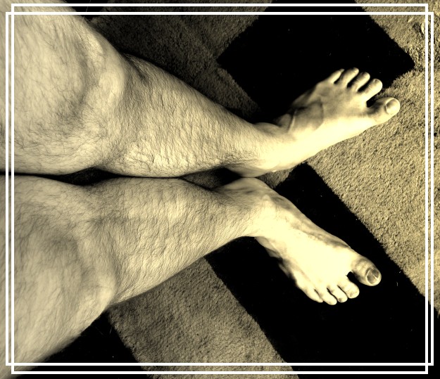
| Hmm... not sure what you are going for here, but it doesn't work for me. Focus is odd with the shallow dof and the focus placement at the calves. Also the composition is very strange -- eye starts at the out of focus feet and then is pulled up the legs and away from what I perceive to be your intended point of interest. The toning isn't warming, so much as jaundiced. |
|
|
|
02/04/2007 09:02:18 AM |
| interesting take on the challenge. the blown light and the carpet don't really work for me though. the inner border is ok for me. |
|
|
|
02/01/2007 08:47:00 PM |
| The perspective is very unique and grabs the viewers attention. The carpeted background does nothing for me. |
|
|
|
01/31/2007 11:25:44 PM |
|
|
|
01/31/2007 02:02:19 PM |
| O.K. it is different and unique, but apart from this your shot says nothing to me. But that's just me. - 3 |
|
|
|
01/31/2007 07:33:08 AM |
| overexposed, very disttracting border |
|
|
|
01/31/2007 12:20:16 AM |
| Normally, when you see a shot of someone's feet, it is a sign of a poor eye and/or a last minute, lack of any good idea, weak effort that looks snapshottish, amateurish, and crappy. :-) That being said, this looks well thought out and works really well, IMO. A dynamic composition and I like the tones. The lighting seems kinda hot (blown out) on the tops of the feet. Nice job. |
|
|
|
01/30/2007 10:34:32 PM |
| I like the perspective and colors a lot, but the burnt highlights and distracting frame bother me |
|
|
|
01/30/2007 08:51:16 PM |
| This has potential. I don't like the clipped highlights on the feet but he lighting in general is nice. The border doesn't add but rather subtracts, IMO. |
|
|
|
01/30/2007 06:55:16 PM |
| The border is very distracting for me, I don't love that the feet are blow out either. Love the concept and angle though. |
|
|
|
01/30/2007 12:10:40 PM |
|
|
|
01/30/2007 07:12:10 AM |
| interesting solution for the contest. i like the tone the over exposition on the foots isn't beautiful.... |
|
|
|
01/29/2007 10:16:08 PM |
| This one is cool. Nice perspective. The border is interesting. It doesn't hurt your photo, but I'm not sure it helps either. Nice color tone for this! |
|
|
|
01/29/2007 08:34:44 PM |
| This is certainly different! I'm a sucker for a man with hairy arms/legs/chest so this ticks all the right boxes for me lol I am a bit put off by the border you have chosen, this really doesn't do anything to enhance the shot IMHO. I do however like the angle and the editing works nicely :o) |
|
|
|
01/29/2007 03:38:28 PM |
| Yes.. nice legs. But not up to the standards of many of the other pictures here. I must say I like the crop. It is actually a picture that could be hung up. (just not at my place) |
|
|
|
01/29/2007 02:59:30 PM |
| dfferent hope they dont vote it down |
|
|
|
01/29/2007 02:31:10 PM |
| hmm not really a great image to look at (weird point of view, overexposed). |
|
|
|
01/29/2007 11:40:45 AM |
| I thought the frog was bad? Well I understand completely, look at the NUDE V challenge. I completely understand. |
|
|
|
01/29/2007 10:47:38 AM |
| not really big on the yellow tone but that's just me..GOOD JOB! |
|
|
|
01/29/2007 01:23:10 AM |
|
Home -
Challenges -
Community -
League -
Photos -
Cameras -
Lenses -
Learn -
Help -
Terms of Use -
Privacy -
Top ^
DPChallenge, and website content and design, Copyright © 2001-2025 Challenging Technologies, LLC.
All digital photo copyrights belong to the photographers and may not be used without permission.
Current Server Time: 03/13/2025 04:42:10 PM EDT.