| Author | Thread |
Comments Made During the Challenge  |
|
|
01/29/2007 08:11:44 AM |
|
 Photographer found comment helpful. Photographer found comment helpful. |
|
|
01/28/2007 01:47:15 PM |
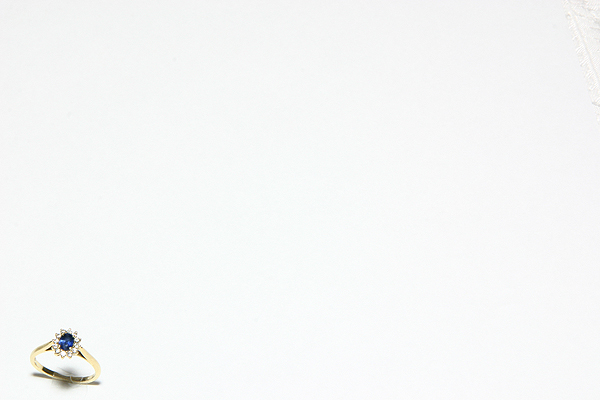
| Definitely minimal. Very good lighting and exposure, good detail. May be almost TOO minimal - such a great capture - could have been just a wee bit bigger. |
|
| Photographer found comment helpful. |
|
|
01/27/2007 12:55:47 AM |
| Very nice color and clarity, but it feels so lost compositionally. Perhaps too minimal? 7 |
|
| Photographer found comment helpful. |
|
|
01/26/2007 02:27:02 PM |
| The ring is pretty, but the negative white space doesn't seem to add anything to the image. Good job on lighting and white balance for a Minimal Editing challenge. |
|
| Photographer found comment helpful. |
|
|
01/26/2007 12:24:39 PM |
| the color and lighting is very nice - but I feel that there is just too much negative space. |
|
| Photographer found comment helpful. |
|
|
01/26/2007 07:35:29 AM |
| Simple, clean and very minimalistic. The deep rich blue of the sapphire really pops visually and calls the eye's immediate attention to it against the stark white background. Tonal detail on the gold seems flat but that can be due to light reflecting back from the white background and illuminating the ring to wash out the warm gold hues. Still it is a wonderful jewelry shot. The other little critique is that there is a spot shadow on the base of the ring that is distracting - looks like there was an overhead light uses that caused the problem. Perhaps two additional lights on each side of the ring would elimnate or lessen that. |
|
| Photographer found comment helpful. |
Home -
Challenges -
Community -
League -
Photos -
Cameras -
Lenses -
Learn -
Help -
Terms of Use -
Privacy -
Top ^
DPChallenge, and website content and design, Copyright © 2001-2025 Challenging Technologies, LLC.
All digital photo copyrights belong to the photographers and may not be used without permission.
Current Server Time: 03/12/2025 02:38:19 PM EDT.