| Author | Thread |
Comments Made During the Challenge  |
|
|
02/06/2007 09:49:25 PM |
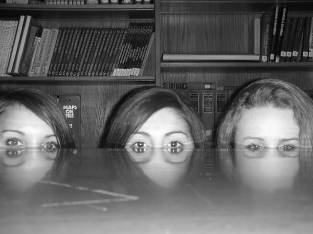
| This is a really cool idea.... The picture would be helped with better lighting, a less distracting background, and no scratch in the table. |
|
|
|
02/06/2007 02:01:51 PM |
| I love the idea of this one - but the conversion to b/w is not very good. Was this a direct conversion, or did you use desaturation using the channel mixer? |
|
|
|
02/06/2007 01:14:53 PM |
| someone read the challenge description... more of these please |
|
|
|
02/05/2007 11:56:33 AM |
| I love the idea! This is an AWESOME picture. Great work! (: |
|
|
|
02/02/2007 04:19:01 PM |
| Creative. I like the perfect reflection on the rightmost subject. Reflection of the middle and left subjects look a bit scary. Good idea. |
|
|
|
02/02/2007 11:44:41 AM |
| What a fun photo! I like the composition of this image, as well as the creativity used. Nice job. |
|
|
|
02/01/2007 05:15:21 PM |
|
|
|
01/31/2007 04:27:02 PM |
| the reflection on the table makes the eyes look really funny |
|
|
|
01/31/2007 03:45:27 PM |
| On my monitor it looks like the focus was a little long (on the books). I think this would have been a very good shot but the lighting is harsh and the table cutting through their eyes looks weird instead of interesting. I think if you could have had them come up a little so they had 4 eyes it would have been better at least in my opinion. Idea and composition are both great. |
|
|
|
01/31/2007 01:03:27 PM |
| i like this alot, the only thing that bothers me is that there seems to be a scratch on the table top or something in the left side of the photo.... im just picky though... |
|
|
|
01/31/2007 11:52:17 AM |
| i think that this photo is very orginial and unique i like it a lot!!! |
|
|
|
01/31/2007 11:50:00 AM |
| I really love the idea behind this photo, it's very original and funny! |
|
|
|
01/31/2007 09:21:18 AM |
| Oh how funny!What a weird effect. |
|
|
|
01/31/2007 03:38:36 AM |
| I think you were onto something here - Maybe just a little more technical attention could have made this a much better shot. For constructive purposes - The scratch or mark on the left of the table should be cropped off or better still re-shot on a better table. The Maps wording behind the girls head on the left is really distracting. Also just making the girls a little more together would help with composition. A great idea though. |
|
Home -
Challenges -
Community -
League -
Photos -
Cameras -
Lenses -
Learn -
Help -
Terms of Use -
Privacy -
Top ^
DPChallenge, and website content and design, Copyright © 2001-2025 Challenging Technologies, LLC.
All digital photo copyrights belong to the photographers and may not be used without permission.
Current Server Time: 03/14/2025 03:50:40 PM EDT.