| Author | Thread |
Comments Made During the Challenge  |
|
|
02/06/2007 10:59:15 PM |
|
 Photographer found comment helpful. Photographer found comment helpful. |
|
|
02/05/2007 08:48:51 PM |
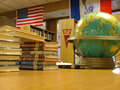
| Way overprocessed. Too much saturation and contrast which gives the image a very harsh feel to it. |
|
| Photographer found comment helpful. |
|
|
02/04/2007 10:28:12 AM |
|
| Photographer found comment helpful. |
|
|
02/01/2007 07:48:15 PM |
| IMHO needs a little white balance adjustment. |
|
| Photographer found comment helpful. |
|
|
01/31/2007 10:35:45 PM |
| white balance seems off to me |
|
| Photographer found comment helpful. |
|
|
01/31/2007 10:29:51 PM |
Okay, I'm sure I'll be the 50th person to say this, but I have to. White Balance!
Your horizon is dead on and the lines are good. The actual table your camera is on is distracting (but what can you do, it's a table top challenge). The shadows are a little distracting, but there's not too much you can do about those except try to get your light source softer.
Good luck. I can only give you average scores. |
|
| Photographer found comment helpful. |
|
|
01/31/2007 03:37:33 PM |
| The room feels too orange |
|
| Photographer found comment helpful. |
|
|
01/31/2007 03:56:48 AM |
| much too saturated, frame doesn't add. otherwise nicely composed |
|
| Photographer found comment helpful. |
|
|
01/31/2007 12:46:39 AM |
| White balance is way off and it makes the reds very distracting IMHO |
|
| Photographer found comment helpful. |
Home -
Challenges -
Community -
League -
Photos -
Cameras -
Lenses -
Learn -
Help -
Terms of Use -
Privacy -
Top ^
DPChallenge, and website content and design, Copyright © 2001-2025 Challenging Technologies, LLC.
All digital photo copyrights belong to the photographers and may not be used without permission.
Current Server Time: 03/14/2025 04:01:55 PM EDT.