| Author | Thread |
|
|
11/20/2003 08:34:04 PM |
Greetings from the Critique Club :)
For starters, when you request an in-depth critique, it is beneficial for you and the critique giver if you have supplied the exposure information and your own comments and thoughts on the photograph :)
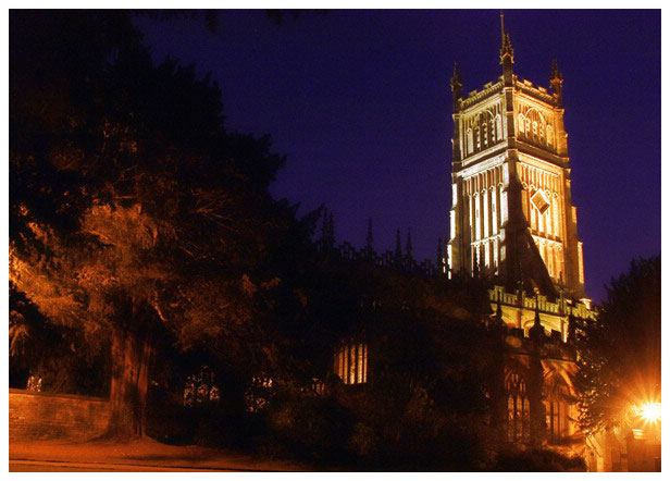
There appears to be some very interesting architecture in this church. The light at night is highlighting the textures and creating a lot of interest. Your chosen composition may work better for a daytime shot since there is a lot of darkness and missing detail here at night. As I look at this image, there is nothing of interest on the left half. This particular scene seems to make a better vertical composition by cropping off the left two thirds.
Without your own thoughts and comments here, I don't understand your choices :)
|
|
Comments Made During the Challenge  |
|
|
11/16/2003 11:58:58 PM |
| This is a great shot of a building on the right but the trees on the left hurt this shot to me. Also the bright light on the right is very distracting to me. A 5 |
|
|
|
11/13/2003 12:44:04 AM |
| Wonderful positioning of the church tower--though I'd like to see all of it and not have it cropped off. The bright light at right upstages the church a little. I love the light and colors on the tower itself, and I also enjoy the trees on the left. |
|
|
|
11/12/2003 03:55:41 PM |
| The bright light in the lower right of your frame grabs all the attention away from what I assume was the point of your picture - you need to pay a bit more attention to highlights in the frame! |
|
|
|
11/11/2003 07:07:28 AM |
| The trees to the left have little detail and detract from your capture. Maybe a tighter or verticle crop would be better. 5 |
|
 Photographer found comment helpful. Photographer found comment helpful. |
|
|
11/10/2003 10:49:01 PM |
| beautiful setting. I know those long shutter speeds are tough to get sometimes. There is quite a bit of noise and the light on the far right pulls my eye away from the church. |
|
| Photographer found comment helpful. |
|
|
11/10/2003 10:09:28 PM |
| the purple of the sky compliments the gold of the lights. the street lamp in the bottomr right is distracting - could you crop it? |
|
| Photographer found comment helpful. |
|
|
11/10/2003 02:37:20 PM |
| Nice picture, I really like the lighting on the building. The gate light or whatever light it is that seems to be very bright at the lower right of the picture should have been cropped out I think. Other than that its a great shot with very nice colors. I really like the color of the sky. |
|
| Photographer found comment helpful. |
|
|
11/10/2003 01:36:21 PM |
| Great colors and lighting. |
|
| Photographer found comment helpful. |
|
|
11/10/2003 07:46:58 AM |
| That light in the lower right corner should have been cropped out. The eye is automatically drawn to it. Nice shot though. The rest of the image is pretty well lit. |
|
| Photographer found comment helpful. |
|
|
11/10/2003 07:14:20 AM |
| Interesting lighting and nice warm colors. |
|
| Photographer found comment helpful. |
|
|
11/10/2003 07:03:35 AM |
| The light on the right is very distracting ! Nice composition although I would prefer to see a little space just above the spires as it looks like they are cropped a little too short ( perhaps missing the very top of them ) |
|
| Photographer found comment helpful. |
Home -
Challenges -
Community -
League -
Photos -
Cameras -
Lenses -
Learn -
Help -
Terms of Use -
Privacy -
Top ^
DPChallenge, and website content and design, Copyright © 2001-2025 Challenging Technologies, LLC.
All digital photo copyrights belong to the photographers and may not be used without permission.
Current Server Time: 04/28/2025 09:18:11 AM EDT.