| Author | Thread |
|
|
11/19/2003 04:09:02 PM |
[Critique Club]
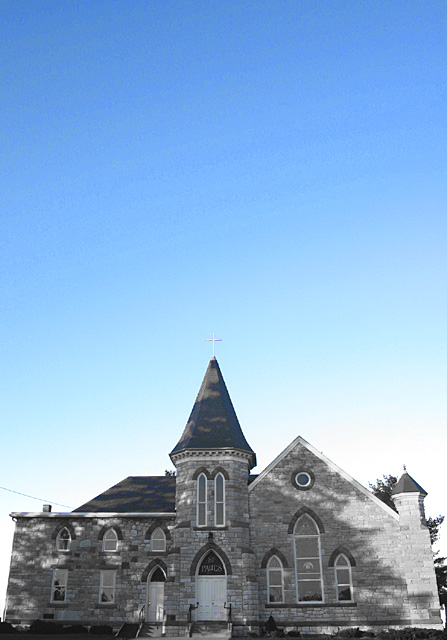
By de-emphasising the church you have effectively concentrated attention on the sky, which on its on isn't interesting. I think that you would need to add more 'punch' to the church to make this one work. In general, selective desaturation is used to emphasise the most important part of the photo, but you've gone the other way here. If there was interesting cloud cover it might have worked better.
I'm undecided about correcting the perspective shift in this one. In some ways it suits the shot given your composition. A closer, more exaggerated view of of the church (still looking up) would have been even more dramatic, and vertical distortion would have added extra impact.
Finally, you chose the wrong time of day for this one - the church is in shadow which de-emphasises it even more. You have some elements of a powerful image here - maybe some more post-processing to emphasise the church would work wonders. |
|
Comments Made During the Challenge  |
|
|
11/13/2003 11:11:45 PM |
| What a pretty church and teh shadows are beautiful! But the negative space at the top it just a bit much. A tighter crop on the top, about 1/2 the sky gone would have really made this shot pop for me. The colors of the church, are those natural or did you play with it a bit in PS? They are very interesting. I started with a 4 on this shot but am bumping it to a 6 |
|
 Photographer found comment helpful. Photographer found comment helpful. |
|
|
11/10/2003 09:37:19 PM |
| Almost seems a little Magritte. It is a nice blue sky. |
|
| Photographer found comment helpful. |
|
|
11/10/2003 07:03:22 AM |
| Nice combination of color and black and white, but too much blank blue sky for my taste. |
|
| Photographer found comment helpful. |
Home -
Challenges -
Community -
League -
Photos -
Cameras -
Lenses -
Learn -
Help -
Terms of Use -
Privacy -
Top ^
DPChallenge, and website content and design, Copyright © 2001-2025 Challenging Technologies, LLC.
All digital photo copyrights belong to the photographers and may not be used without permission.
Current Server Time: 04/11/2025 03:08:23 PM EDT.