| Author | Thread |
|
|
11/24/2003 04:27:38 AM |
welcome to your first from the critique club,
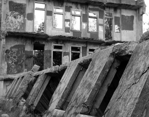
MightyB, this was a good idea, and a good choice of location; decay and chaos are always inspiring subjects.
Composition wise the diagonal that separates the picture in two equal parts makes it a bit static to me.
Content wise, what I would expect to see in this kind of setting is to sense how the humanity related actually lived and suffered. Unfortunately you show us only vertical parts (where only things belong) that do not really hint us the past function of this recent ruin. A glimpse of what is inside one of these openings, a partial view of a courtyard or any relevant object (door handles, bars, bench etc. would add some strength to the photograph and help the viewers, more adequately, imagine a scene from this building�s past.
All the best, JJ |
|
 Photographer found comment helpful. Photographer found comment helpful. |
|
|
11/19/2003 06:53:56 PM |
Hey all,
Thanks for the input. Glad ya'll liked the photo.
I aslo think "blindjustice's" comment about the whole scene promoting a sense of ease is correct. A little more tension, perhaps by having used a monochromatic coloring?, would have helped my scoring a little bit. I also think a better book title would have given a little more insight as to what the photo was about. But, as of yet, none of our local talent has challenged the subject of Dr. Waughop's little hospital. |
|
Comments Made During the Challenge  |
|
|
11/15/2003 09:50:06 PM |
| "Gracefully Insane", what a title! I like the picture too, all the rectangles at different angles, and the graffitti. B/W is a good choice here. ~8 |
|
| Photographer found comment helpful. |
|
|
11/15/2003 01:30:21 AM |
| I love old torn down buildings like this and yours is no exception. Great shot, good composition and I like it in black and white. |
|
| Photographer found comment helpful. |
|
|
11/14/2003 08:44:31 PM |
| Nice lines, very smooth. Unfortunately, although you display a ratty, franctic building and title the composition accordingly, the picture puts me at ease- it doesn't represent the shot because it is too pretty. |
|
| Photographer found comment helpful. |
|
|
11/14/2003 04:04:45 PM |
| WOW... the framing draws my eye to the back then the long windows up to the top. A real journey for the eyes. 9 |
|
| Photographer found comment helpful. |
|
|
11/12/2003 03:42:28 AM |
| interesting choice of book. intersting photo. the perspecitve and lines are intriguing. |
|
| Photographer found comment helpful. |
Home -
Challenges -
Community -
League -
Photos -
Cameras -
Lenses -
Learn -
Help -
Terms of Use -
Privacy -
Top ^
DPChallenge, and website content and design, Copyright © 2001-2025 Challenging Technologies, LLC.
All digital photo copyrights belong to the photographers and may not be used without permission.
Current Server Time: 03/12/2025 01:19:10 PM EDT.