Hey Jeff-- I know you're looking for comments, so I figured I'd leave a few.. Well, I already left you a comment during voting, though, it wasn't very helpful, just something I'd noticed.
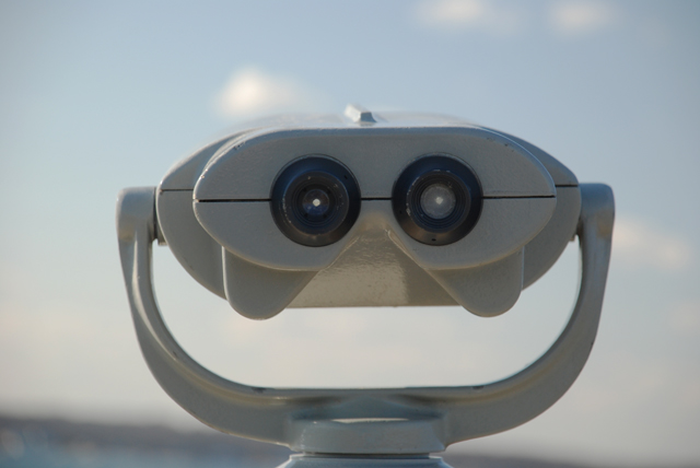
I think what this photo needed was either a bit more dramatic lighting (this was probably taken mid day?), maybe a bit more contrast (play with those levels or curves), and the composition itself is pretty static. Almost dead center and taking up a good majority of the frame. I'd probably either put it off to the side more, or else give more negative space around the "face". Either of those ideas would put the focal point more in line with the rule of thirds.
As others mentioned, the horizon is very tilted, which you'll usually get negative comments about. Granted, if you had fixed that, your face would have been crooked then, which would have caused even more problems! So, probably either cropping further up, or cloning out the horizon would have been your best solutions to that.
Hope this helps! :) |