| Author | Thread |
|
|
11/25/2003 05:41:08 AM |
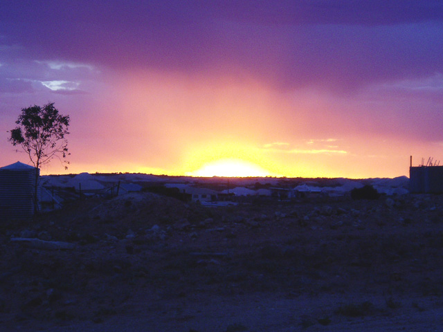
Thank you to all who responded for your honest appraisal of my first submission to a challenge, the photo was taken of a sunset from our front porch, it was reduced in size from the original but has not been modified in any way.
We get these kind of skies morning and evening several times a month so I have plenty to work with. The "Looking for Gold" was a slightly tongue in cheek reference, the only gold is the sun right in our face. The pale shapes that draw your eyes to the foreground are actually waste dirt piles from opal mining.
Once again, thank you for the comments and i look forward to putting up more of our amazing country for your appraisal.
|
|
|
|
11/23/2003 02:35:50 AM |
From the Critique Club
This picture almosts looks like a painting. I'm trying to figure out if I think that is a good thing or a bad thing. The colors looked very nice at first but the more I look, the more (if slightly) un-natural they look. Perhaps from oversaturation? One cool effect is that the sun is so bright that I keep finding my eye wanting to avoid it, just like the real thing!!!
The biggest downfall of this image is the foreground. There is a lot of it (half the shot) and you cannot really pick out any good details for your eye to rest on after it is driven away from the sun. You can tell that there are tents and things there, but can't really see what they look like. Possible solutions, a fix in PS with levels or maybe contrast/brightness, or even better is a different crop with much less ground in the final composition.
All in all a very nice image that with a little work could make a great one! Keep shooting 'cause I want to see more of your work!
TC |
|
 Photographer found comment helpful. Photographer found comment helpful. |
Comments Made During the Challenge  |
|
|
11/18/2003 12:48:08 PM |
| Kinda blurry but it's a beutiful picture. My vote 8. |
|
| Photographer found comment helpful. |
|
|
11/17/2003 09:16:07 PM |
|
| Photographer found comment helpful. |
|
|
11/16/2003 09:28:29 PM |
| This shot has a real glow to it. The idea definitely comes across. |
|
| Photographer found comment helpful. |
|
|
11/15/2003 10:34:28 PM |
I love that Big big sun! The foreground is an eerie gray blue, but the starkness of this shot lies in the contrast. I like how you managed to keep the detail in the foreground while showing shadow on the tree and the big sunrise. Perhaps you could put the horizon lower in the shot and show more beatiful sky and less foreground.
Message edited by author 2003-11-23 15:48:00. |
|
| Photographer found comment helpful. |
|
|
11/14/2003 03:44:49 PM |
| Now if you'd called it The Manhattan Project, this would have been a scary photo. Neat trick of light though, and intriguing image. My eye is drawn to the blank foreground space though, and i don't find anything of interst there - the tents and rubble seem too high in the frame to gain emphasis, but not insignificant enough to be ignored.Would love to see it cropped an inch or so from the bottom, not least to get the horizon out of the middle of the frame, which really doesn't seem to suit this shot. |
|
| Photographer found comment helpful. |
|
|
11/14/2003 02:35:46 PM |
| Splendid. There are no words for such a scene. The colours are wonderful and in total the sky makes you feel so insignificant compared to it's greatness. 10 |
|
| Photographer found comment helpful. |
|
|
11/14/2003 01:39:10 PM |
| nice complementary colors. You;ve pushed the saturation a bit too far - see the pink pixels int the blue cloud. I like the blue light on the landscape - very monotone. Looking for gold in a barren land. |
|
| Photographer found comment helpful. |
|
|
11/14/2003 06:01:32 AM |
|
| Photographer found comment helpful. |
|
|
11/13/2003 08:00:31 PM |
| I like the rainbow effect in the sky and the deep blue tint for the foreground. Perhaps some of the left & right side could have been cropped but that is just my subjective viewpoint. Nice shot! |
|
| Photographer found comment helpful. |
|
|
11/12/2003 08:06:19 PM |
| Nice colors. Unfortunately tbough, the foreground (i.e. the thing which relates the subject to your chosen book title) is a bit too dark so the whole thing loses impact and relevance. It's possible, however, that shadow detail could be recovered using contrast masking - or you could have used a graduated neutral density filter when taking the shot to darken the sky and reveal more detail in the foreground. |
|
| Photographer found comment helpful. |
|
|
11/12/2003 07:28:16 PM |
|
| Photographer found comment helpful. |
|
|
11/12/2003 01:51:15 PM |
| The foreground is a bit dark in this shot, good idea though. |
|
| Photographer found comment helpful. |
|
|
11/12/2003 07:33:13 AM |
| next time try to get the horizon at the lower 1/3rd or top 1/3rd rather than getting at the exact middle... This can make dramatic changes to your photo. However this is a nice photo.. You could use a little bit of gamma correction! I hope this helped you atleast a bit! :) |
|
| Photographer found comment helpful. |
Home -
Challenges -
Community -
League -
Photos -
Cameras -
Lenses -
Learn -
Help -
Terms of Use -
Privacy -
Top ^
DPChallenge, and website content and design, Copyright © 2001-2025 Challenging Technologies, LLC.
All digital photo copyrights belong to the photographers and may not be used without permission.
Current Server Time: 03/12/2025 06:59:57 PM EDT.