| Author | Thread |
|
|
11/30/2003 10:25:09 PM |
CRITIQUE CLUB CRITIQUE
by karmat
Congrats on your first entry. You met the challenge well, and that is very important to many of the voters here.
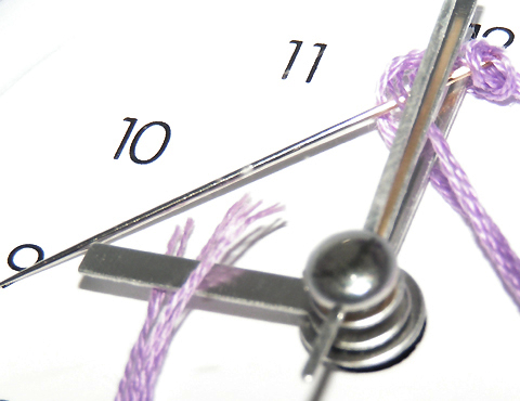
I think the overall composition is fairly strong here. The hands of the clock and the needle form a triangle, which always seems to add some stability to a picture. Also, the center of the hands (where they are "anchored"), is positioned in a strong spot on the bottom right third, and I think this helps the shot to feel stable, and yet not stagnant like a centered placement would do. The thread leaving the frame in one area and re-entering it in another adds interest and make the shot "fun," I think.
The choice of purple was good to add some color to the shot. The white is almost too bright, I think, and seems to be "washing out" some in the upper left corner. Also, there is some glare on the needle that is really bright. I think to help tone this down, as well as get more of the subject in focus would be to have a larger aperture number. Though I think a shallow depth of field here would be okay at some angles, having the large round part out of focus hurts because that is where the eyes rests first.
Overall, well done and I look forward to seeing your future entries. If you have any questions or comments, please contact me.
karmat |
|
 Photographer found comment helpful. Photographer found comment helpful. |
|
|
11/26/2003 09:22:42 AM |
| Thanks to all that took the time to comment. I learned a lot from the comments on how I could've made my first attempt a lot better. |
|
Comments Made During the Challenge  |
|
|
11/19/2003 10:46:36 PM |
| Nice try- but, the crispness is just not there, maybe its the angle, I do like the purpel though. |
|
| Photographer found comment helpful. |
|
|
11/19/2003 08:07:29 PM |
| Not a bad idea but this photo is overexposed. I like the colour thread you used, but the colour's richness is washed out by by the overbearing whitness of the background. The clock hands are out of focus: you may want to try increasing the depth of field next time. I also find the crop is just a tad too tight. |
|
| Photographer found comment helpful. |
|
|
11/17/2003 01:26:39 PM |
| the lighting is pretty harsh here. i also think that you shouldn't have tried to use such a shallow depth of field in this instance. good idea, though. |
|
| Photographer found comment helpful. |
|
|
11/17/2003 09:24:40 AM |
this is a great idea, I feel that the photograph could have been a little better
the string and needle look over saturated or contrasted
I think the clock hands would look better in focus rather than out of, perhaps with the numbers out of focus.
what I do like about this photo is the colors, the white space, the composition, and the simpless of it. |
|
| Photographer found comment helpful. |
|
|
11/17/2003 03:32:48 AM |
| drat, a bit over-exposed... |
|
| Photographer found comment helpful. |
|
|
11/17/2003 12:09:21 AM |
| Very imaginative. This is a great shot |
|
| Photographer found comment helpful. |
Home -
Challenges -
Community -
League -
Photos -
Cameras -
Lenses -
Learn -
Help -
Terms of Use -
Privacy -
Top ^
DPChallenge, and website content and design, Copyright © 2001-2025 Challenging Technologies, LLC.
All digital photo copyrights belong to the photographers and may not be used without permission.
Current Server Time: 03/12/2025 11:17:57 PM EDT.