| Author | Thread |
|
|
06/06/2004 11:34:11 AM |
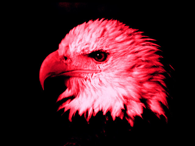
| this photo is fantastic. the eagle is in a perfect position. I think the red adds to the picture and makes it more unique and powerfull. extremely well done. |
|
 Photographer found comment helpful. Photographer found comment helpful. |
|
|
11/28/2003 12:37:40 AM |
Greetings from The Critique Club
I am afraid this picture is going to give me troubles. Is hard to tell someone that you don't like something. You might hurt his feeling and this is not at all my intention. Specially when looking through the portfolio, all the rest is so incredible beautiful. I am sorry. I think it is the red next to the shades of pink that makes me look away. That what it is. It hurts the eyes. Otherwise, the photo has something to tell for itself. It looks as much as a flame as it looks like a bird. The red is a very intense color and can suggest lots of things starting from love and ending with rage. But it doesn't help the picture. The focus is good, I like the spark in the eye of the eagle. Somewhere, probably in PS the photo got a bit noisy. Other than that, no more complains. Everything else is good. I really hate that I have to post something like this. The good thing is that I can edit this at any time so if you have any complains, PM me and I'll look again at it.
Anyway... is just my opinion... others might think different.
Best regards, Elena |
|
| Photographer found comment helpful. |
|
|
11/26/2003 01:34:44 AM |
| i would like to see your original and to sse how it could be edited |
|
Comments Made During the Challenge  |
|
|
11/24/2003 12:50:01 AM |
| a very powerful statement but the red really distracts |
|
| Photographer found comment helpful. |
|
|
11/21/2003 11:13:52 AM |
| Interesting to have it this dark - makes the "bald" head seem to hover in space. Brings focus to the eye, themeatically. Wish the feathers and beak were sharper. The red color adds to the propaganda effect - angry eagle bent on revenge - watch out! Wold be more powerful with a more dramatic composition - more blackness to the left and below for the eagle to be looking into planning to swoop down? |
|
| Photographer found comment helpful. |
|
|
11/19/2003 10:50:47 PM |
| I personally don't care much for the red tint to this shot, think it would look better black and white. 8 |
|
| Photographer found comment helpful. |
|
|
11/19/2003 12:21:19 PM |
| Don;t know what the reddening of the fead feathers is about - blood on the plumage of the american national bird? Moderately intersting image - photographically, I'd be more intersted in less (perhaps not none) processing: I fear you may have detracted from a good photo. |
|
| Photographer found comment helpful. |
|
|
11/19/2003 12:41:26 AM |
| I don't care for your color cast. Nice shot otherwise. 4 -danny |
|
| Photographer found comment helpful. |
Home -
Challenges -
Community -
League -
Photos -
Cameras -
Lenses -
Learn -
Help -
Terms of Use -
Privacy -
Top ^
DPChallenge, and website content and design, Copyright © 2001-2025 Challenging Technologies, LLC.
All digital photo copyrights belong to the photographers and may not be used without permission.
Current Server Time: 03/12/2025 02:31:59 PM EDT.