| Author | Thread |
|
|
03/05/2007 01:54:18 PM |
Greetings from the Critique Club. The following comments are in response to your request for a critique on your challenge submission. Please feel free to send me a PM concerning my comments.
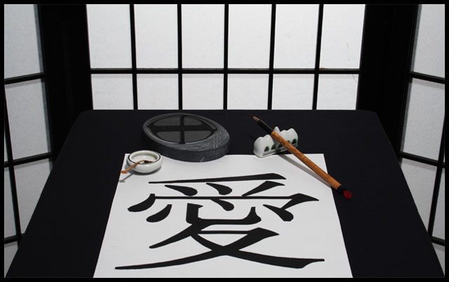
The first thing that strikes me about this image is the near perfect symmetry that frames the main subject. The repetition of lights and darks hold the theme together. I like the rhythm of lines as they repeat throughout--in the background, in the ink stone, and in the calligraphy. The composition seems carefully planned. It feels like a black and white photo in color...very controlled and interesting.
As a couple of your commenters mentioned, I too would like to see something a bit different with done with the lighting. I think, first, the white balance could be improved in post-processing to make the whites really white--they seem a bit grey and make the image feel a little dull on the whole. The greyish tones in the side panels indicate depth...but I wonder if their difference in tone doesn't hurt the graphic quality of the presentation.
I think lighting would also help define the center of interest. I'm not sure where exactly my eye should rest...I keep being drawn to the cross reflected in the puddle on the ink stone and keep wanting to explore the brush more but am drawn away. I wonder if the scene were not so evenly lit if a center of interest could be defined a bit more and if there might be a bit more energy in the image.
One of your commenters mentioned that the character does not seem like it was made with that brush and I agree. It seems slightly out of place because the scale does not appear correct for the tool. If, instead, you had made many of the characters on the paper as if a teenager were practicing...well, that would be a different image then, I suppose?
I think this image relates to the challenge "Love II" fairly well for those familiar with the character. The title really is needed for those who are not familiar with it. If the English word "Love" had been drawn on the paper instead I'm fairly sure the image would have scored lower as inconsistent with the setting. But because we are primarily looking at a word and there is nothing else here that necessarily conveys the concept of love the connection with the challenge is not as strong as it might be.
Overall, this is a wonderfully graphic image that has appeal. It would make a perfect cover for a greeting card.
Keep creating!
--Kadi |
|
 Photographer found comment helpful. Photographer found comment helpful. |
|
|
02/28/2007 02:02:18 AM |
| For those of you that asked, the character in the photo is in fact how love is written in Chinese. Thanks for all the great comments. |
|
Comments Made During the Challenge  |
|
|
02/27/2007 02:04:40 PM |
|
| Photographer found comment helpful. |
|
|
02/27/2007 12:54:04 PM |
| IF (and I'm going to assume it does) this chinese letter means LOVE, then this is an excellent ribbon deserving shot. 10 |
|
| Photographer found comment helpful. |
|
|
02/27/2007 06:45:15 AM |
| Nicely set up and clinically symmetrical. Clean stock image. My only criticism is that the character is more likely printed than drawn with that brush pen. The character itself has little or no quality of emotion in it as a result of having no connection to the art of calligraphy. |
|
| Photographer found comment helpful. |
|
|
02/26/2007 10:36:11 AM |
| Nice, neat composition but lacks attention to detail(dust), I think it lacks focus as well. |
|
| Photographer found comment helpful. |
|
|
02/25/2007 06:23:33 PM |
|
| Photographer found comment helpful. |
|
|
02/24/2007 10:11:18 PM |
|
| Photographer found comment helpful. |
|
|
02/24/2007 12:15:27 PM |
| Finally, something a bit different from the hearts, flowers, and kissing couples. I like it. The only small quibble would be that I'd like the whites to be a bit brighter. The paper, in particular, looks a tiny bit grey. |
|
| Photographer found comment helpful. |
|
|
02/23/2007 03:40:51 PM |
|
| Photographer found comment helpful. |
|
|
02/21/2007 07:44:50 PM |
| i think it would work well in b&w too... btw, how do we know that it's love? i can't read chinese |
|
| Photographer found comment helpful. |
|
|
02/21/2007 11:13:10 AM |
| Nice setup.. I like the black and white theme throughout, yet the shot itself hasn't been converted. |
|
| Photographer found comment helpful. |
|
|
02/21/2007 10:20:11 AM |
| I like the layout and choice of objects, but would love to see some more emotive lighting, perhaps a spotlight coming throught the back screen and the sides fading to black. |
|
| Photographer found comment helpful. |
Home -
Challenges -
Community -
League -
Photos -
Cameras -
Lenses -
Learn -
Help -
Terms of Use -
Privacy -
Top ^
DPChallenge, and website content and design, Copyright © 2001-2025 Challenging Technologies, LLC.
All digital photo copyrights belong to the photographers and may not be used without permission.
Current Server Time: 03/12/2025 03:27:55 PM EDT.