| Author | Thread |
|
|
11/24/2003 05:12:55 PM |
Greetings from the Critique Club
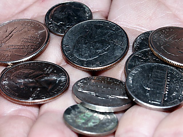
composition
I really enjoy the shapes formed by the negative space between the coins, although I think that this could be brought out a lot by having a solid colored background. The crease between the hands that runs off of the top/center of the image is sort of distracting, but easily fixed by trying different angles.
color
If this image were converted to black and white the blue and skin colored reflections would look more like silver, and the green on the dime would not be a problem. This would also help bring out the negative shapes that I mentioned previously.
contrast
I would have liked to see more midtones, see lighting.
focus
Macro is tricky. If you don't hold your camera at the exact right distance often times it is easy to focus on a subject that was meant to be secondary such as the hands in this instance. Try taking the same shot with the camera about an inch further from the subject to capture the coins in sharp focus, and take some of the emphasis off of the hands.
depth of field
Again try to increase the amount of coins in sharp focus. I reccomend setting them on a solid background, and using a longer exposure time.
lighting
I would try taking a light gray card and trying to capture the reflection of it to change the color of the coins faces to be lighter and add more midtones. Also try bouncing your flash off of a ceiling so that the glare doesn't bounce back into the lens creating those distracting white spots on the coins.
any other element of the photo that stands out or is lacking in some way
I think that this was a wonderful idea for the challenge, and with a little bit of development could have easily been one of the best. Hope this helps. ~Rob |
|
 Photographer found comment helpful. Photographer found comment helpful. |
Comments Made During the Challenge  |
|
|
11/18/2003 08:32:32 AM |
| The dof seems a bit shallow. I'd like to see this same idea on a solid color background.... a good idea for this challenge! |
|
| Photographer found comment helpful. |
|
|
11/17/2003 02:32:16 PM |
| This would look much better as a b&w photo, with a slight soft focus to take off some of the bold shiny edges, as well as the distracting shine on the hands |
|
| Photographer found comment helpful. |
|
|
11/17/2003 09:58:10 AM |
| I like your idea but the photo could have been a little better. While your hand is very sharp the coins are a tad off. The clarity of them is not 100%. Good try though! |
|
| Photographer found comment helpful. |
Home -
Challenges -
Community -
League -
Photos -
Cameras -
Lenses -
Learn -
Help -
Terms of Use -
Privacy -
Top ^
DPChallenge, and website content and design, Copyright © 2001-2025 Challenging Technologies, LLC.
All digital photo copyrights belong to the photographers and may not be used without permission.
Current Server Time: 03/13/2025 08:28:52 AM EDT.