| Author | Thread |
|
|
12/01/2003 12:23:27 PM |
Critique Club:
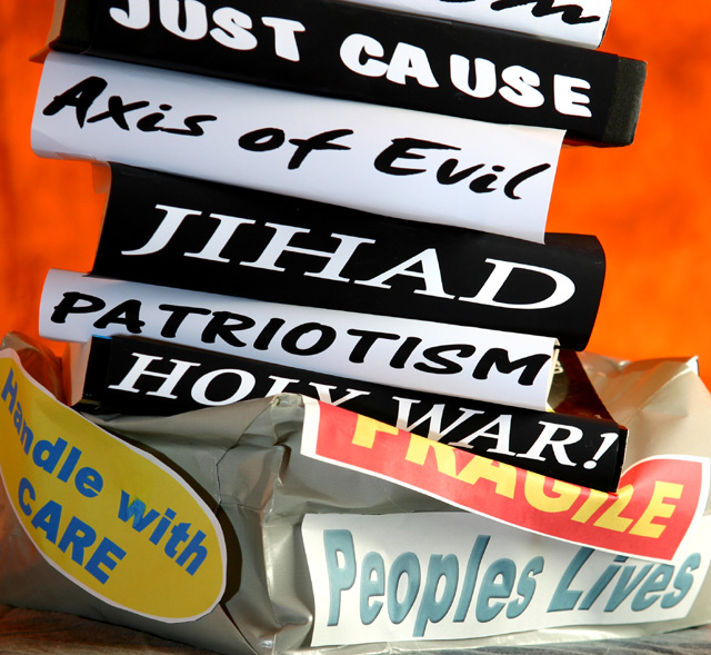
A powerful piece of propaganda... although my own take on this picture is one of awareness rather than propaganda! The line is very fine, and maybe depends on whether you believe it or not. Any political advertising you don't believe in can be called propaganda I guess.
Anyway... the idea is a good one. A complex argument is simplified into a hard hitting image. I like the fact that the pro-war sound bites are in black and white, symbolic of the way that the pro-war contingency seemed to perceive the situation. The fragile parcel was a superb idea, a clever way of putting across the fact that the war was not in people's best interests. The 'Handle with care' sticker strongly implies that the opposite was in fact true. The picture really carries across the obsessiveness with looking at the pro-war arguments without considering the whole picture.
As far as the photography goes, the picture doesn't have quite enough attention to detail for my taste. For example, I'd have liked the background a smooth orange with no shadows and distracting detail.
Also, the edges of the paper used for the pro-war slogans seem a little sloppy. The highlights seem a little burnt out at the bottom right of the frame. A point that irks me about the photo is that I can't tell what the pro-war slogans are... are they books? The problem here is that they don't automatically convey weight to me. Could this have been solved by using a cartoon-like weight with the slogans on?
The base that the parcel is resting on also seems out of place. It really needs a smooth, non-distracting texture.
In conclusion, an inspired idea, a great piece of propaganda which just needs a little more polish. I personally wasn't sure about your title which seems rather unwieldy.
Message edited by author 2003-12-01 12:25:30. |
|
 Photographer found comment helpful. Photographer found comment helpful. |
Comments Made During the Challenge  |
|
|
11/25/2003 05:00:15 PM |
Very good, and so timely. I think this would have been a bit better with out the handle with care,, while I think I understand your reason for including it, it does add one too many elements.
I also might have had all the signs in black and white except for th fragile and background. That would have given a more conitinuous theme. 9 |
|
| Photographer found comment helpful. |
|
|
11/21/2003 01:46:12 PM |
| The firy BG... great, the messages piled up... great, the crashed handle with care peoples lives package... absolutely great. The messzge is strong & obvious here. Fits the challenge profoundly! I also like the dual message in you title. Very creative shot. |
|
| Photographer found comment helpful. |
|
|
11/21/2003 01:07:00 AM |
| I can see tape! (On the "Axis of Evil") Red...red..where is the red? I see orange, especially when compared with the "FRAGILE" sign. Good job fitting the challenge, but try to get those labels taped (or better yet, glued!) down so that there aren't annoying shadows. |
|
| Photographer found comment helpful. |
|
|
11/21/2003 12:40:58 AM |
| Pretty interesting. Glad you didn't bias this and ruin it, and instead included both "sides". :) |
|
| Photographer found comment helpful. |
|
|
11/20/2003 12:59:10 PM |
| wonderful clarity and composition...nicely done...10. |
|
| Photographer found comment helpful. |
|
|
11/20/2003 05:34:29 AM |
| Excellent. Good strong message and very good composition. I like the way the pile extends out of view. |
|
| Photographer found comment helpful. |
|
|
11/19/2003 10:06:36 PM |
|
| Photographer found comment helpful. |
|
|
11/19/2003 12:42:33 AM |
| This is excellent. You have gotten the message across, loud and clear! 9 -danny |
|
| Photographer found comment helpful. |
Home -
Challenges -
Community -
League -
Photos -
Cameras -
Lenses -
Learn -
Help -
Terms of Use -
Privacy -
Top ^
DPChallenge, and website content and design, Copyright © 2001-2025 Challenging Technologies, LLC.
All digital photo copyrights belong to the photographers and may not be used without permission.
Current Server Time: 03/12/2025 02:47:05 AM EDT.