| Author | Thread |
|
|
03/14/2007 11:54:20 AM |
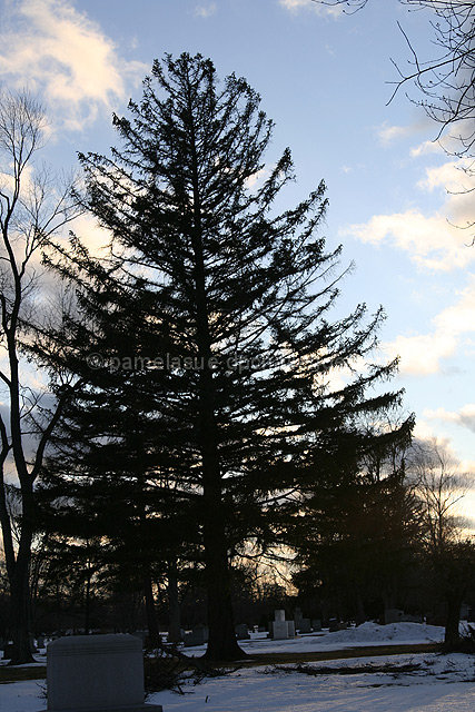
| I think your silhouette may have been more effective if there was less "stuff" in the background, which now fill the spaces between the branches where the sunset could show through. Perhaps moving a bit to the left from where you took this might have shown the main tree against a more open area. Also, lack of a clear horizon makes this look as though it's tilted counter-clockwise, even though the man-made structures(?) seem to show that you had the camera level. |
|
 Photographer found comment helpful. Photographer found comment helpful. |
|
|
03/07/2007 06:09:42 PM |
The technicals: 1) It crooked, eh? 2) I have a very hard time figuring out how to make pines and firs look nice. They just tend to look black or dark green and gross. I don't have an answer for you on that. You did well to control the sky highlights.
The feel: One problem I see here is that the part of the picture which "joins" the companions is the part which our eye is least drawn to. Instead we catch the sharp contrast of the light sky and the dark tree. I'm not sure what to recommend to improve that.
The game: Minimal editing is so tough and you took on a picture that would be hard to get right even with advanced editing. I think minimal is going to be about a very straightforward and simple shot. Next minimal challenge, go for that. |
|
| Photographer found comment helpful. |
|
|
03/07/2007 04:09:37 PM |
The sky looks great. I'd say the contrast has the tree a little too dark and you can't see any details. It also blends in with the background tree. But mostly people probably got you with the tilt.
Just as a precautionary...even though you can't immediately tell by looking at the photo...brightness/contrast, levels, and curves, violate minimal editing rules. |
|
| Photographer found comment helpful. |
|
|
03/07/2007 02:27:21 PM |
| First off, you're eligible for the highly coveted and rarely awarded ribbon for No Comments Received During a Challenge (I have it in my profile - feel free to PM me and I'll send you a copy!). A very nice, soft sky and a pretty tree, though it's leaning a bit. That's perhaps one of the hardest aspects of minimal editing, is not being able to crop or straighten an image. |
|
| Photographer found comment helpful. |
|
|
03/07/2007 01:52:10 PM |
Hi Pam,
In the photo, I would say the thing that threw off the voters the most was the horizon, to me (partilly cross-eyed) it sees a bit tilted to the left. Also the gravestone in the foreground probably should have been full or omitted because this is what gives the feeling of being tilted. I havent yet studied the minimalism rule set yet but I would have said a bit of hue and saturation would have helped the sky color.
Rich |
|
| Photographer found comment helpful. |
|
|
03/07/2007 01:49:56 PM |
| Pam, this shot is definately not sub 5 material in my opinion. I didn't vote in this challenge, but I am guessing it lost points in the framing of the shot. Your horizon if tilted down from right to left - although that may very well have been your intent. Also, the gravestone in front is cut off a little at the bottom. I can't see how you could have cropped out the other trees without it cutting into your subject itself. The tree certainly creates a silhouetted effect you were going for. Thanks for sharing. |
|
| Photographer found comment helpful. |
Home -
Challenges -
Community -
League -
Photos -
Cameras -
Lenses -
Learn -
Help -
Terms of Use -
Privacy -
Top ^
DPChallenge, and website content and design, Copyright © 2001-2025 Challenging Technologies, LLC.
All digital photo copyrights belong to the photographers and may not be used without permission.
Current Server Time: 03/14/2025 03:54:11 AM EDT.