| Author | Thread |
Comments Made During the Challenge  |
|
|
11/25/2003 09:49:36 PM |
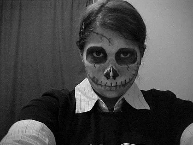
| This could do better whit a box of cigarettes. |
|
|
|
11/24/2003 11:16:14 PM |
| I like the graininess of the shot... makes it look dirty like ciggarettes... but the background doesn't wrok well with the subject |
|
|
|
11/24/2003 05:01:51 PM |
| ouch ! enough said. good shot |
|
|
|
11/23/2003 07:18:26 PM |
| The digital noise enhances the message of this photo, but the Noise Filter is acceptable by DPC rules and gives a more uniform (and less distracting) result than the compression artifacts it looks like were used here. |
|
|
|
11/21/2003 11:47:39 AM |
Scary. Nice comment of smoking, and the marketing of smoking. I could go two ways with this - either strip away all of the familiar - the everyday clothes, the background - have the face leering out of the darkness with cigarette in hand -
OR
have this skeletal figure in a totallye everyday situation - sitting at the luinch table with friends offering a cigarette. |
|
|
|
11/20/2003 09:55:27 PM |
|
|
|
11/20/2003 09:31:45 PM |
| Perhaps a full black robe with the hood on, and a pack of cigarettes would bring your thoughts to the viewer better. 5 -danny |
|
|
|
11/20/2003 04:52:55 PM |
| i guess this would be more effective if it looked like the subject was actually trying to sell cigarettes. i think this depends too much on the title. |
|
|
|
11/20/2003 03:45:17 AM |
| Very well done indeed. The b&w and grain gives this impact. Nice makeup job as well. |
|
|
|
11/19/2003 05:46:55 PM |
| The half wall half curtain background doesn't really work, I would have used one or the orther. Good work on the make up tho, that mouth is really freaky! |
|
|
|
11/19/2003 03:34:30 PM |
|
|
|
11/19/2003 02:00:00 PM |
| I understood the look you were trying to achive, but this photo doesn't give the feeling, mabey some cigarettes in the picture would have helped out. |
|
|
|
11/19/2003 01:03:28 PM |
| This would be more effective and understood without the title if you had a cigarette in the photo. Of course, you might not have any available. |
|
|
|
11/19/2003 12:44:52 PM |
| nice idea, but would have been better if the cigarettes were visible! |
|
|
|
11/19/2003 08:07:15 AM |
| Looks like a "Say No to Drugs" campaign. Technically, the shot is not composed very well, due to a lot of unfocused areas. Could be a shallow dof, but it is probably due to a longer exposure. Either way, the balance is flat and the picture does not convey the message well without the words. |
|
|
|
11/19/2003 02:47:22 AM |
| I like this, the noise in the piicture too adds that extra feel too it. Maybe a touch lighter and I would have put it up a mark. 8 |
|
Home -
Challenges -
Community -
League -
Photos -
Cameras -
Lenses -
Learn -
Help -
Terms of Use -
Privacy -
Top ^
DPChallenge, and website content and design, Copyright © 2001-2025 Challenging Technologies, LLC.
All digital photo copyrights belong to the photographers and may not be used without permission.
Current Server Time: 03/12/2025 08:08:27 AM EDT.