| Author | Thread |
|
|
04/01/2010 10:03:08 PM |
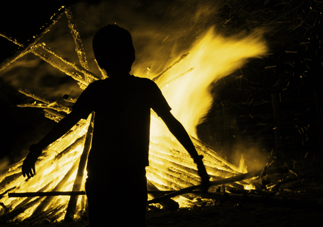
| I like the silhouette and this has such an evil feel to it. Nice job. |
|
|
|
03/08/2007 01:49:49 PM |
Positives:
There are emotional aspects of this image that are appealing. The boy in front of the fire begs the viewer to speculate what the child is experiencing and thinking. Placing the subject between the brightest flame and photographer works well.
Technicals:
Sharpness is not bad, but could be better.
A problem with low light situations is that the image tends to be overly yellow(as is likely in your case) or red(as common with people images) because of white balance issues under those conditions. If you have to overcome those issue then you may already have lost the battle for a great photograph regardless of content.
You did the best you could under those conditions but really stood no change to overcome that.
In its own way the use of yellow is fine, but the lack of other color detail gives it a superficial, overprocessed appearance.
The challenge:
Again, the assumption of voters for a free study is images of the highest technical quality. When disappointed they punish the images with a low score. That is not to say the image deserves the lower score, it is just the way DPC voters think. |
|
 Photographer found comment helpful. Photographer found comment helpful. |
Comments Made During the Challenge  |
|
|
03/07/2007 04:50:52 AM |
|
| Photographer found comment helpful. |
|
|
03/05/2007 10:22:15 PM |
|
| Photographer found comment helpful. |
|
|
03/05/2007 08:17:46 PM |
| wonderful photo. his arms at the same angles as the firewood makes him a creature of fire. The processing gives this a horror-movie feel. Lots of mood and attitude in this photo. 8 |
|
| Photographer found comment helpful. |
|
|
03/04/2007 08:44:09 AM |
| I'm not sure if I'm fond of the processing loss of the color in this. The attractiveness of fire is better seen with the reds, yellows...and blacks of the fire. |
|
| Photographer found comment helpful. |
|
|
03/04/2007 07:27:23 AM |
| Nice I like the silhouette |
|
| Photographer found comment helpful. |
|
|
03/01/2007 11:34:32 AM |
| interesting. i like the dark look. |
|
| Photographer found comment helpful. |
|
|
03/01/2007 09:41:13 AM |
| Sweet almost abstract feel. |
|
| Photographer found comment helpful. |
Home -
Challenges -
Community -
League -
Photos -
Cameras -
Lenses -
Learn -
Help -
Terms of Use -
Privacy -
Top ^
DPChallenge, and website content and design, Copyright © 2001-2025 Challenging Technologies, LLC.
All digital photo copyrights belong to the photographers and may not be used without permission.
Current Server Time: 03/17/2025 06:20:52 AM EDT.