| Author | Thread |
|
|
03/08/2007 04:31:42 AM |
| Thanks for taking the time for a thorough look and analyses, appreciate that very much :) |
|
|
|
03/07/2007 04:54:40 PM |
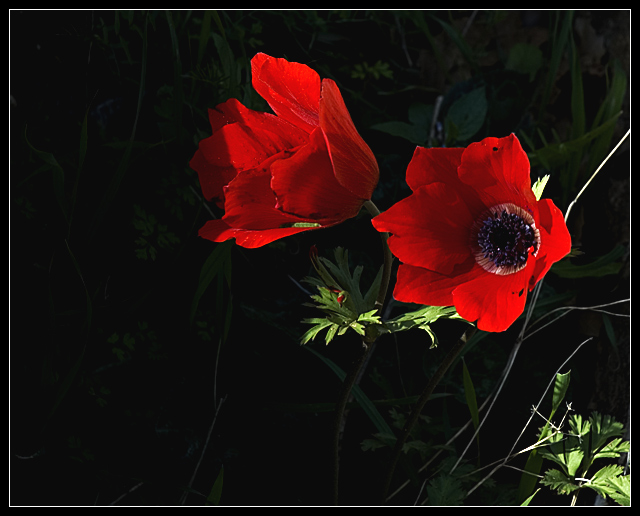
| My reaction to this shot was I think based primarily on the effect the colors had on the light in the image. They look bright, but really the whole thing seems bright. I'm not one to say that low key has to be B&W, but the red really exaggerates (at least to my eyes) the overall brightness it. This to me seemed bright overall (even with the background darkened as it was) to be low key. I did a quick conversion to black and white; do that and take a look, it might help you see what I think I was seeing in the color version. The histogram might help, too; it shows a spike at the dark end and then pretty level across the rest of the spectrum. Not definitive, but says something. I hope that helps a bit, sorry for rambling on. |
|
 Photographer found comment helpful. Photographer found comment helpful. |
Comments Made During the Challenge  |
|
|
02/28/2007 06:01:45 AM |
|
Home -
Challenges -
Community -
League -
Photos -
Cameras -
Lenses -
Learn -
Help -
Terms of Use -
Privacy -
Top ^
DPChallenge, and website content and design, Copyright © 2001-2025 Challenging Technologies, LLC.
All digital photo copyrights belong to the photographers and may not be used without permission.
Current Server Time: 03/19/2025 11:37:45 PM EDT.