| Author | Thread |
Comments Made During the Challenge  |
|
|
03/07/2007 11:00:32 PM |
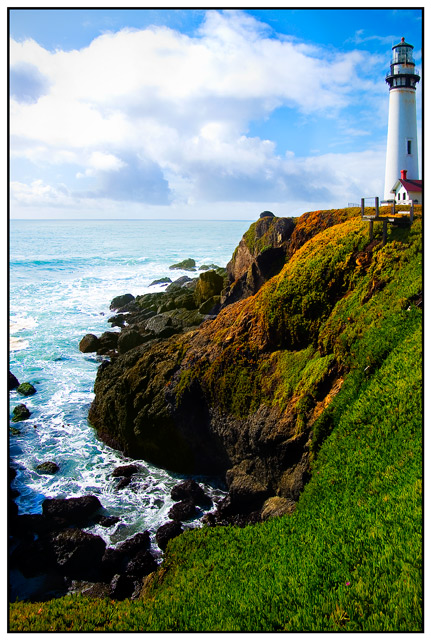
| I really like this this photo. I feel the lighthouse is too close to the edge of the frame and would have benefited a bit further away but I still think this is a nice capture. good job |
|
|
|
03/07/2007 07:13:57 PM |
| I would score higher if the light house was not so crammed to the edge. |
|
|
|
03/07/2007 07:23:30 AM |
| WOW...lovely colours and clarity..9 |
|
|
|
03/07/2007 02:51:17 AM |
| Nice capture - Love the tones just wish the lighthouse had a little more breathing space |
|
|
|
03/06/2007 09:46:39 PM |
| Beautiful shot, the colors are incredible and the composition is right on. Well done. |
|
|
|
03/06/2007 09:20:15 AM |
| Beautiful colors and clarity, but IMNSHO, you need to get the light house in or out of the shot -- it's too close to the margin. |
|
|
|
03/06/2007 07:40:33 AM |
| the colours seem a little too vibrant (over saturated?) to me. Sorry if you didn't adjust in PP |
|
|
|
03/05/2007 06:38:44 PM |
| Beautiful colors and clarity |
|
|
|
03/05/2007 03:23:51 PM |
| I like the composition with the lighthouse not being dead center. I would have maybe given it just a little more room on the right side. It almost looks "chopped off". |
|
|
|
03/04/2007 06:50:01 PM |
| I wish it wasn't cropped so close to the lighthouse. |
|
|
|
03/04/2007 01:44:10 PM |
| Wonderful rich colors! Nice composition. |
|
|
|
03/04/2007 01:16:26 AM |
| Did you saturate the sky? It looks too blue on the right. Maybe I just live in a polluted place. |
|
|
|
03/04/2007 12:49:54 AM |
| This looks like a postcard - I really like the processing. |
|
|
|
03/02/2007 11:52:30 PM |
| The tones in this are really nice. I think I'd like the photo a little better if the lighthouse wasn't so close to the edge of the picture. |
|
|
|
03/01/2007 07:56:13 PM |
| I like this a LOT... I can't help but think that the lighthouse needs just a teeny bit more breathing room on the right, though. I might have panned just a little more to the right. Still a darned fine shot, though :) |
|
|
|
03/01/2007 07:09:04 PM |
| A bit too bright for my liking (but what do I know?). I would've like to see more behind the lighthouse. |
|
|
|
03/01/2007 03:02:59 PM |
| IMO it needs a little more space to the right of the lighthouse. |
|
|
|
03/01/2007 08:33:47 AM |
| It's a little tight on the right, I'd like to see a bit more space beyond the lighthouse. Clouds are a bit blown out but overall a beautiful scene. |
|
|
|
03/01/2007 12:28:44 AM |
| the cropping on the right seems uncomfortably close to the light house. Beautiful colors and balance of negative and positive space. |
|
Home -
Challenges -
Community -
League -
Photos -
Cameras -
Lenses -
Learn -
Help -
Terms of Use -
Privacy -
Top ^
DPChallenge, and website content and design, Copyright © 2001-2025 Challenging Technologies, LLC.
All digital photo copyrights belong to the photographers and may not be used without permission.
Current Server Time: 03/12/2025 02:16:17 AM EDT.