| Author | Thread |
|
|
03/14/2007 09:44:42 AM |
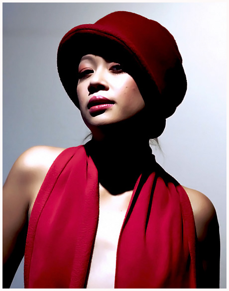
| WOW. I guess I'm not surprised about the majority of comments, but I totally find the contrast and harsh lighting to work REALLY well. It's different. It's fun. The lighting gives a fashion/editorial feel. I can see this is a magazine. I really love what you did with it. I had given it a 10. |
|
 Photographer found comment helpful. Photographer found comment helpful. |
Comments Made During the Challenge  |
|
|
03/11/2007 10:35:23 PM |
| The lighting is a bit harsh for my taste. I do like the dynamic range of the background. and the pose. |
|
| Photographer found comment helpful. |
|
|
03/10/2007 02:55:02 AM |
| Nice shot. The light is perhaps a little bright and harsh. You need to soften it by using a light former, or reflecting off something. |
|
| Photographer found comment helpful. |
|
|
03/08/2007 01:21:46 PM |
| Very fashionable photograph. Good color and tone. Nicely done! |
|
| Photographer found comment helpful. |
|
|
03/08/2007 08:26:04 AM |
|
| Photographer found comment helpful. |
|
|
03/07/2007 06:18:41 PM |
| I am drawn to this originally I wasnt fussed with it but it grew on me Maybe the shadow area is somewhat too dark for my liking but it is a stunner the top right corner to me would also needs brning in |
|
| Photographer found comment helpful. |
|
|
03/07/2007 05:43:38 PM |
| really like the contrast. the skin looks overdone. |
|
| Photographer found comment helpful. |
|
|
03/07/2007 02:38:04 PM |
| The posture and comp look like it could be in a magazine, but the first thing I thought of when I saw the picture was how blown out part of her face was, then the same on her chest. I think if you fixed that you could be onto a winner though. |
|
| Photographer found comment helpful. |
|
|
03/07/2007 10:35:56 AM |
Great use of lighting.
Nice crop, good choice of background colour too - really makes the colours stand out.
Superb skin tones and great soft textures on the red elements.
10. |
|
| Photographer found comment helpful. |
|
|
03/07/2007 08:15:02 AM |
| way too much contrast, lights are blown, no drawing left in the shadows. otherwise well composed, good expression |
|
| Photographer found comment helpful. |
Home -
Challenges -
Community -
League -
Photos -
Cameras -
Lenses -
Learn -
Help -
Terms of Use -
Privacy -
Top ^
DPChallenge, and website content and design, Copyright © 2001-2025 Challenging Technologies, LLC.
All digital photo copyrights belong to the photographers and may not be used without permission.
Current Server Time: 03/10/2025 07:21:35 PM EDT.