| Author | Thread |
|
|
03/18/2007 07:12:22 AM |
Hi, Greetings from the Critique Club:
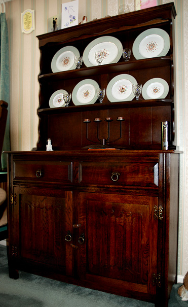
Composition: I like the idea and the richness of the dresser. However, I don't like the clutter on top and around the dresser, especially the open doorway and the object on the lower right of the item. Maybe try a different angle for this image. There are two ornaments (??) on the lower part of the dresser...I can understand the candle but I can't make out the one on the right, therefore I cannot relate it to the story. That is basically what you have to think about...telling a story. If any part of that image is not necessary...then get rid of it.
Technical: I like the lighting and the focus for the image. I can see you have cropped in, judging by your Aperture and the Focal Range. I do like the richness of that wood...and that really does hold the viewers attention...but as I said before the clutter is damaging to not only your image but your score.
Overall: Great try...and a beautiful sample of a piece of Furniture...but wrong composition for the best way to display this subject.
NOTE - I was just about to finish this critique when I read your about. Why do you crop and resize so close to opening the image. You never know when this would make a great print. I always do any adjustments first and save as a PSD. I also save as a new image in JPEG and that is the one I will then open and crop/resize/sharpen/sfw. It gives you greater control when you are working on a larger image. |
|
 Photographer found comment helpful. Photographer found comment helpful. |
Comments Made During the Challenge  |
|
|
03/10/2007 09:40:13 AM |
| Not much here to really make an impact on the viewer. This seems more like a photo you would use to try to sell this item. |
|
| Photographer found comment helpful. |
|
|
03/09/2007 11:54:06 PM |
| There seems to be a beautiful wood grain to work with and I wish the focus was on that...especially the bottom portion. As is, the crop leaves off the right cabinet foot (I don't think this is a dresser). Other distractions on the lower right, left curtains and background wall items could have been left out. You have a nice piece of furniture though...5 |
|
| Photographer found comment helpful. |
|
|
03/09/2007 02:37:13 PM |
| This is a great piece of furniture, but it needs some different lighting to bring out the great tones and details. |
|
| Photographer found comment helpful. |
|
|
03/05/2007 04:42:56 PM |
| Looks too much like an add for sale on ebay - Sorry but the composition is off the cropping of the leg is wrong - Just looks like a snap shot. |
|
| Photographer found comment helpful. |
|
|
03/05/2007 07:03:57 AM |
| It's just what the title says it is. That said, the picture is of the sort that one would post on Ebay to sell it. There could be more definition/illumination of detail in that respect. 5 |
|
| Photographer found comment helpful. |
|
|
03/05/2007 12:23:59 AM |
OK...I want to help you here...
This is the kind of image you should use on EBay if you were selling this lovely piece of furniture. There is nothing creative or interesting about your shot at all. There are a ton of dsitrations like the flash lighting and the cards on the top...
sorry :-( |
|
| Photographer found comment helpful. |
Home -
Challenges -
Community -
League -
Photos -
Cameras -
Lenses -
Learn -
Help -
Terms of Use -
Privacy -
Top ^
DPChallenge, and website content and design, Copyright © 2001-2025 Challenging Technologies, LLC.
All digital photo copyrights belong to the photographers and may not be used without permission.
Current Server Time: 03/14/2025 01:36:28 AM EDT.