| Author | Thread |
|
|
03/18/2007 12:25:32 AM |
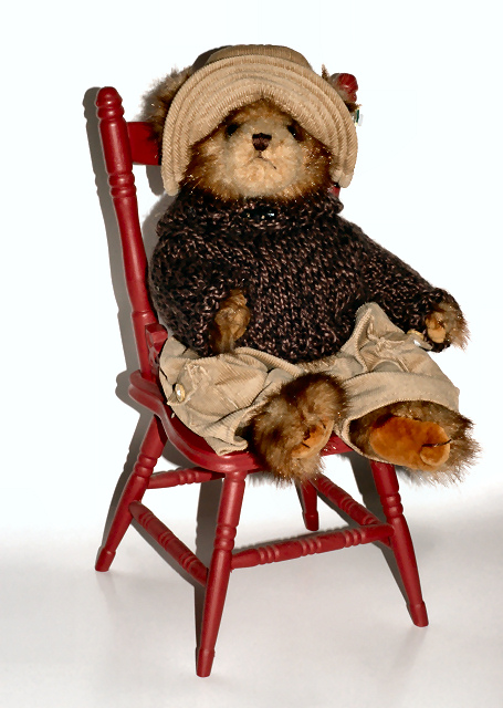
Hi, Greetings from the Critique Club:
Composition:Now this is cute. It has so much potential. At the moment it looks very much like a stock photo. You need to break away from that for this subject. Maybe put a little flower pot with flowers and a bow on the floor next to the chair. An additional mini photo in a frame hanging in the background would look great. It would complete the story. And not be a 'stick the subject on a white background and take a picture' style shot!
Technical:This is the main area that has let you down. I have uploaded my version to show you what I mean with the backdrop. I can see what you were aiming for but it has actually let the image down. Go for a clean image....with as little detail as possible. This image needs to be clean, bright, cute and colourful. Hence the addtion of the photo frame in the background and the flowers. The greyed floor is NOT suitable for this image. Also, rid yourself of those shadows. A general rule is to have the subject a minimum of the same distance from the backdrop as it is in height. Example - 6 foot tall person should be a minimum of 6 foot from the backdrop. Now you are also photographing a still life. So why use a flash. Use a light and bounce it off some small foil covered boards if need be. Use a tripod and low ISO with a long shutterspeed. Use a narrow aperture also. Your subject is NOT going to run away...so why take a quick shot?
Overall: I think this gorgeous bear and chair needs to make another appearance...but I think the bear needs to befriend the photographer and together they work as a team. Keep up the great effort and ideas in your work...and please....don't give up.
 |
|
 Photographer found comment helpful. Photographer found comment helpful. |
Comments Made During the Challenge  |
|
|
03/11/2007 11:30:16 PM |
|
| Photographer found comment helpful. |
|
|
03/11/2007 10:40:06 AM |
| If you didn't use a flash on this you could've avoided the stark shadowing. |
|
| Photographer found comment helpful. |
|
|
03/10/2007 09:37:36 AM |
| The shadows are really distracting. If you were to move the chair further away from the wall, you would not see them. |
|
| Photographer found comment helpful. |
|
|
03/09/2007 11:04:44 PM |
| great setup, maybe shadows a little sharp |
|
| Photographer found comment helpful. |
|
|
03/09/2007 05:53:23 AM |
| I find the wall shadow to arsh... but other than that, this is a beautiful and colorful presentation.. |
|
| Photographer found comment helpful. |
|
|
03/05/2007 02:37:34 PM |
| Nice capture - Next time though get that white background further away to get rid of those annoying shadows. It really will help make the image stand out. You can see where the chair meets the paper on the left hand side and it's distracting. |
|
| Photographer found comment helpful. |
|
|
03/05/2007 01:47:12 PM |
| Very cute, are the white specks sensor dust? |
|
| Photographer found comment helpful. |
|
|
03/05/2007 09:45:19 AM |
| harsh lighting hurts this one ... |
|
| Photographer found comment helpful. |
Home -
Challenges -
Community -
League -
Photos -
Cameras -
Lenses -
Learn -
Help -
Terms of Use -
Privacy -
Top ^
DPChallenge, and website content and design, Copyright © 2001-2025 Challenging Technologies, LLC.
All digital photo copyrights belong to the photographers and may not be used without permission.
Current Server Time: 03/14/2025 10:23:56 PM EDT.