| Author | Thread |
|
|
04/12/2007 01:17:51 PM |
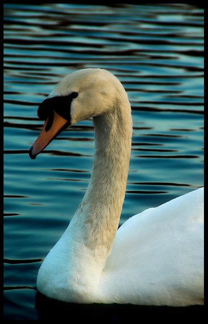
| May I make a suggestion? Please don't take it as criticism, but I've take an few shots of mute swans, and I find that if you boost the colour saturation the neck seems to change to a pleasing bright yellow. I think if that if the cropping were a little less boxed in and the water ripples (which are very nice BTW) were level, it would make a lot of difference. On a brighter note, this shot seems to have some sort of a "purity" to it. I'm not sure how to better describe it, but I like it. |
|
 Photographer found comment helpful. Photographer found comment helpful. |
|
|
04/12/2007 12:04:25 PM |
| I think it's the darkness of the head area that gets people saying it's too dark. People expect swans to be pure white (not that they really ever are). The result (on my crappy laptop montior) is the eye get lost. The crop is nice, but I think it's a bit tight. My .02� |
|
| Photographer found comment helpful. |
Comments Made During the Challenge  |
|
|
04/07/2007 09:59:04 PM |
| Nice focus and good job with keeping the details in the whites. Looks a bit cool, though - I think you could ramp up the exposure 1/2 a step and make this pop a lot more. |
|
| Photographer found comment helpful. |
|
|
04/05/2007 03:16:21 PM |
| I love the water, but the border isn't working for me... or maybe it's just cropped too much. Nice shot though - keep it up! |
|
| Photographer found comment helpful. |
|
|
04/03/2007 12:48:50 PM |
| Nice photo, though kind of dark in the head area. Playing with the light settings I think would have made this even better. |
|
| Photographer found comment helpful. |
|
|
04/03/2007 07:10:44 AM |
Right then, joke's on me as I now have to plough through 564 images and bump them all (yes, all of them) up. There'll be a third run through for fine tuning. It's day two three now and I'm running late, sorry.
Dark at the head. 5 |
|
| Photographer found comment helpful. |
|
|
04/01/2007 03:12:58 PM |
| Well, I have to be honest, the shot doesn't really appeal to me. I'm not sure if its too dark or just not as clear as I think it should be. Maybe its the subject. I have to go with a 6. |
|
| Photographer found comment helpful. |
Home -
Challenges -
Community -
League -
Photos -
Cameras -
Lenses -
Learn -
Help -
Terms of Use -
Privacy -
Top ^
DPChallenge, and website content and design, Copyright © 2001-2025 Challenging Technologies, LLC.
All digital photo copyrights belong to the photographers and may not be used without permission.
Current Server Time: 03/14/2025 04:06:42 AM EDT.