| Author | Thread |
Comments Made During the Challenge  |
|
|
11/30/2003 11:31:00 AM |
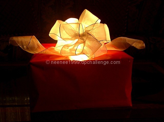
| What a neat idea! When first I looked at this image I do not think I gave it thought it deserved. Your use of light and the classic red and gold of the present and bow, put things together well. maybe a little more rotation of the package to give just one more dimension...Like when taking a picture of a building and creating perspective? I'm bumping this shot. Good luck! |
|
 Photographer found comment helpful. Photographer found comment helpful. |
|
|
11/28/2003 11:55:56 PM |
| Yes it does. As this gift lights up! The light is a bit bright on the back and there is a blown out spot on the front top of the box. I like the idea and the dark background is a good idea but is that a book on the left? A 7 |
|
| Photographer found comment helpful. |
|
|
11/26/2003 08:14:14 PM |
| nice touch, though the chair or whatever in the front left is distracting because its right at the point that is attracted by the rule of thirds. |
|
| Photographer found comment helpful. |
|
|
11/26/2003 07:38:45 AM |
| Beautiful. Love the way you lit this. The background is perfect, but the little glare on the left could have been avoided. Also if you are really centering this, then you could crop a bit more on the right to make it equal on both sides. |
|
| Photographer found comment helpful. |
|
|
11/26/2003 12:50:52 AM |
Nice Idea! I did think of doing something similar but couldnt get it to look right
Well Done
|
|
| Photographer found comment helpful. |
|
|
11/24/2003 06:28:14 PM |
| Very visually poetic. The illumination of the bow in nice. Wish the wrapping were neater, and the book (?) to the left draws our attention away. Maybe a bit o light fro the side would help fill out the box, define its shape. Also I wish the box were aligned better with the edge o the picture, or completely at an angle to it. |
|
| Photographer found comment helpful. |
|
|
11/24/2003 06:02:27 PM |
|
| Photographer found comment helpful. |
|
|
11/24/2003 09:10:08 AM |
| I love the idea, but I feel the light was just a bit to much. It's distracting. |
|
| Photographer found comment helpful. |
|
|
11/24/2003 08:28:44 AM |
| Pretty and clever, but imho there's too much contrast - more detail is needed in the bottom part of the pic. |
|
| Photographer found comment helpful. |
|
|
11/24/2003 08:24:15 AM |
| ooooh if only the background was completely black! that would make all the difference in the world! Nice job with the lighting! Focus is good, I like the colors. Nice job. |
|
| Photographer found comment helpful. |
|
|
11/24/2003 08:21:13 AM |
| Beautiful ! The lighting is perfect ! |
|
| Photographer found comment helpful. |
|
|
11/24/2003 03:15:29 AM |
| Great lighting, this photo works well. |
|
| Photographer found comment helpful. |
Home -
Challenges -
Community -
League -
Photos -
Cameras -
Lenses -
Learn -
Help -
Terms of Use -
Privacy -
Top ^
DPChallenge, and website content and design, Copyright © 2001-2025 Challenging Technologies, LLC.
All digital photo copyrights belong to the photographers and may not be used without permission.
Current Server Time: 03/12/2025 08:59:22 AM EDT.