| Author | Thread |
Comments Made During the Challenge  |
|
|
12/02/2003 09:22:14 AM |
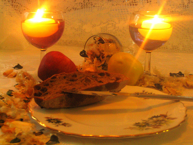
| I think the candles tend to dominate the picture too much, leaving the food without detail and hard to see. |
|
|
|
12/02/2003 07:49:26 AM |
| The glare from the glasses is distracting... you might try bouncing the light next time - it looks like it might be pointing right at the glasses from the side or above? Since you have a glass lying down in the background, it might have helped to shoot this at a bit higher of an angle. There is a bit of grain as well, that might have been from adjusting the color balances too much? Over all nice idea, but I think if you play with the lighting a bit, you might find better results. Since it appears to be breakfast food, how about trying this in some natural light... |
|
|
|
12/01/2003 09:10:49 PM |
| I could see exactly what is on and around the plate, in the glass... the candle are too bright, it distracts. |
|
|
|
12/01/2003 05:10:21 PM |
| nice composition, and pretty colors. Focus is good, but could have been better on the plate. There is a crease in the material that is tilted, it is throwing off the balance of the photo, and the lighting may have looked better if the candles lit most of the shot, rather than an overhead light - nice shot |
|
|
|
12/01/2003 01:47:18 PM |
| Most of the stuff that has scents seems so far away! The bread(?) being on the far side of the plate makes this seem somewhat unbalanced; if the plate were plain, I might just see it as negative space, but since there's decor on it, it just feels off. I do really like the neat flare off the candles, it really draws attention there, and candles definitely have a scent of their own. |
|
|
|
11/28/2003 04:01:14 PM |
| as you've probably heard the backdrop is ugly, and I also think a little more fill light to tone down the candles a little would help. Like the color, and layout. |
|
|
|
11/28/2003 03:07:44 PM |
| The color is altered, may be WB is wrong |
|
|
|
11/27/2003 10:57:52 AM |
| A little yellow! Maybe a need a white balance to it but over all good picture |
|
|
|
11/27/2003 03:30:56 AM |
| Badly lit, badly staged, focus soft, floating candles in wine glasses too bright. |
|
|
|
11/26/2003 05:25:28 PM |
| Too much gleam & orange. Nice idea though |
|
|
|
11/26/2003 09:28:05 AM |
| The yellow is to extreme. My eyes can't focus on the shot do to the yellows being so far apart and strong. Nice idea, but.. |
|
|
|
11/26/2003 12:19:44 AM |
| Now this is gorgeous, the lighting is wonderful, the set up is beautiful good job on this one |
|
 Photographer found comment helpful. Photographer found comment helpful. |
Home -
Challenges -
Community -
League -
Photos -
Cameras -
Lenses -
Learn -
Help -
Terms of Use -
Privacy -
Top ^
DPChallenge, and website content and design, Copyright © 2001-2025 Challenging Technologies, LLC.
All digital photo copyrights belong to the photographers and may not be used without permission.
Current Server Time: 03/13/2025 05:59:14 AM EDT.