| Author | Thread |
|
|
02/13/2008 05:44:35 PM |
|
Comments Made During the Challenge  |
|
|
03/20/2007 07:20:03 PM |
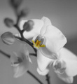
| I think the grain is a little heavy and it oversadows the colour of the image. sorry. I do like the crop and this may have been better in B&W |
|
|
|
03/19/2007 08:58:48 AM |
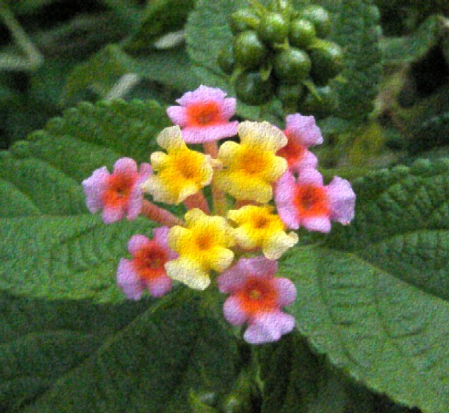
| I see a lot of texture here but very little grain. 8( |
|
|
|
03/19/2007 06:19:25 AM |
| The grain doesn't really enhance this image. Ideally, one would look for a subject to work with the grain. Good colors but the composition is weak. |
|
|
|
03/18/2007 11:19:42 AM |
| This looks more like a texture to me than grain, but I might be wrong. The colours of the flower are wonderful against the rich green background but they are placed too central in the frame. I would suggest using rule of thirds to position the flowers. |
|
|
|
03/15/2007 02:15:13 PM |
|
|
|
03/14/2007 11:26:20 AM |
| I like the texture of the grains in the image. It makes the flowers look very soft and touchable. |
|
|
|
03/14/2007 07:56:46 AM |
| Er... that looks somewhat terminally out of focus |
|
Home -
Challenges -
Community -
League -
Photos -
Cameras -
Lenses -
Learn -
Help -
Terms of Use -
Privacy -
Top ^
DPChallenge, and website content and design, Copyright © 2001-2025 Challenging Technologies, LLC.
All digital photo copyrights belong to the photographers and may not be used without permission.
Current Server Time: 03/10/2025 09:33:26 PM EDT.