| Author | Thread |
|
|
04/27/2007 10:37:13 AM |
| Hi Kristin, wow, this one is superb. Great eye on this one. I think you got hosed on your score. This should've scored much higher. Keep up the great work and I hope that we get a chance to shoot together one of these days. |
|
 Photographer found comment helpful. Photographer found comment helpful. |
|
|
03/21/2007 08:58:00 AM |
| This is good and certainly should have scored higher. |
|
| Photographer found comment helpful. |
|
|
03/21/2007 12:08:33 AM |
| Oh, you were robbed! I was one of your 10s; loved the angle and this was one where I thought the grain really enhanced the overall look and feel of the image, rather than just being an added feature because it was a "grain" challenge. Nice job. |
|
| Photographer found comment helpful. |
Comments Made During the Challenge  |
|
|
03/19/2007 10:06:16 AM |
|
| Photographer found comment helpful. |
|
|
03/18/2007 10:48:32 AM |
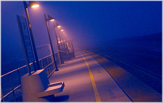
| I think your tilted perespective has made this a cool image! |
|
| Photographer found comment helpful. |
|
|
03/18/2007 09:29:27 AM |
| To much tilted for my taste, otherwise great picture. |
|
| Photographer found comment helpful. |
|
|
03/15/2007 10:57:01 PM |
| Great light, colors, horizon, grain......what an excellent photograph to use as a teaching aid for various photography techniques. Awesome! |
|
| Photographer found comment helpful. |
|
|
03/15/2007 01:51:37 PM |
| This one is only OK for me, dawg. There's just a lot of chroma noise that seems to be in this one, like in the shadows on the platform between the lighted areas. |
|
| Photographer found comment helpful. |
|
|
03/14/2007 10:08:50 AM |
| I wish you didn't find it necessary to include your ISO on your title. The graininess certainly enhances the fell here, and the tilt of the image adds a dynamic that's effective. It could perhaps use more contrast - a stronger sense of the dark, and for a really effective image I would say it is too cluttered along that line of the lightposts - the signs, the seats, the vehicles, the buildings confuse the sense of simplicity that exists in the right side of the image. |
|
| Photographer found comment helpful. |
|
|
03/14/2007 09:48:35 AM |
| Bleak & lonely. I love the lines & the way the light falls to the platform. Without the tilt this would be a more ordinary shot, the tilt adds a dynamic feel. Grain in colour usually hurts my eyes, but you've got it just right here. Wonderful shot! |
|
| Photographer found comment helpful. |
Home -
Challenges -
Community -
League -
Photos -
Cameras -
Lenses -
Learn -
Help -
Terms of Use -
Privacy -
Top ^
DPChallenge, and website content and design, Copyright © 2001-2025 Challenging Technologies, LLC.
All digital photo copyrights belong to the photographers and may not be used without permission.
Current Server Time: 03/11/2025 01:32:37 PM EDT.