| Author | Thread |
|
|
03/26/2007 03:48:29 PM |
|
 Photographer found comment helpful. Photographer found comment helpful. |
Comments Made During the Challenge  |
|
|
03/25/2007 08:03:20 AM |
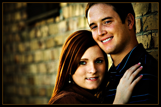
| This is a beautiful portrait but sincerely to me its over saturated... JMHO |
|
| Photographer found comment helpful. |
|
|
03/25/2007 06:14:52 AM |
| Nice PP - Maybe her hand is just a little distracting. |
|
| Photographer found comment helpful. |
|
|
03/20/2007 11:54:15 PM |
all those beautiful warm tones - and her JARRING pink nails just smack you upside the head! Can't be helped though - looks like she paid a lot for that pink.
Overall this feels too processed to me. It's left photography and approaches illustration. A neat trick no doubt, one that I can appreciate in other applications - but doesn't work for me here. 6 |
|
| Photographer found comment helpful. |
|
|
03/20/2007 04:33:41 PM |
| I like the framing, composition of this. Depending on what kind of look you're going for. Personally I think romantic (if that's what you're going for) photo's look better with less contrast...softer. My personal choices doesn't effect my scoring. I think the photo is very nice. 9. |
|
| Photographer found comment helpful. |
|
|
03/20/2007 01:14:02 AM |
| The contrast is really high here, but i like it it works for me |
|
| Photographer found comment helpful. |
|
|
03/19/2007 11:28:26 PM |
| I really like this shot a lot. The composition and balance of the subjects are very nice, and the background is appropriate with beautiful bokeh. I also like the contrast on the model's faces; it really adds some depth to the shot. Somehow her eyes feel just a bit too oversaturated for my tastes... I know many voters here seem to love that extremely pure tone, but I feel it's a little unnatural and actually on the side of feeling over processed for me. That being said, I think my biggest gripe is actually not the photo itself but rather the border; while I feel the thin band of color is simple and appropriate to use, it feels a little warmer/saturated compared to the bulk of the rest of the picture and I would rather the subjects maintain the focal vibrance. That in no way has anything to do with the actual photograph, however, and I'm not going to let a border affect my rating; just an impression I have of the overall presentation. Great job. |
|
| Photographer found comment helpful. |
|
|
03/19/2007 11:59:22 AM |
|
| Photographer found comment helpful. |
|
|
03/19/2007 12:12:35 AM |
| Excellent work on the setup and editing of this photo. It is awesome! |
|
| Photographer found comment helpful. |
Home -
Challenges -
Community -
League -
Photos -
Cameras -
Lenses -
Learn -
Help -
Terms of Use -
Privacy -
Top ^
DPChallenge, and website content and design, Copyright © 2001-2025 Challenging Technologies, LLC.
All digital photo copyrights belong to the photographers and may not be used without permission.
Current Server Time: 03/14/2025 09:28:30 AM EDT.