| Author | Thread |
|
|
04/04/2007 12:34:22 PM |
Positives:
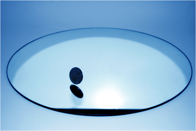
Simple, clean image. Simplicity serves to focus attention on the coin. Blue duotone works well to add viewer interest without adding clutter.
Technicals:
Generally OK but need improvements. Clarity/focus is a little soft, possibly due to 1/6th shutter speed. Technical excellence is paramount for an image like this. Though you did cleanup you missed a sensor dust spot at the middle top edge of the image. There is some kind of flaw just above the upper right side of the plate or mirror, could be a refection off something. The round light reflection below to the right of the coin looks overexposed. Viewers can see there is detail on the coin but not really make out what it is and that will act as a distraction.
Though individually these items are minor, combined they will be noticed by viewers and lower the score.
The Challenge:
The coin, though obviously 'still', may be viewed by some voters as stop action and therefore not really 'still' so could get some dnmc backlash.
Suggestions:
Obviously you want to address the overexposed light reflection and the other items mentioned. You want the technicals PERFECT for this image.
This image begs to be a little sharper. If taken hand held you might consider bumping up ISO even more for a faster shutter speed to reduce movement for a sharper plate and increased DOF. If you used a tripod then shoot at a LONGER shutter speed and higher f/stop to try to improve the overall sharpness of the plate. Consider adding some front lighting on the coin for better brightness and definition.
It is a semi-centered composition. Simplistic compositions such as this benefit greatly from offset placement of the main subject.
In 'advanced' editing (and I realize this is not) you can fix and/or reduce the effects of overexposure by cloning nearby detail into the overexposed area with a low opacity brush. The effect is remarkably natural and works like a charm. |
|
 Photographer found comment helpful. Photographer found comment helpful. |
Comments Made During the Challenge  |
|
|
04/02/2007 04:25:44 AM |
| Good work! I like the use of such a small border. Small borders are the best. I made the mistake of using a huge border on one challenge and ruined my chances though it wasn't blue ribbon quality anyway. |
|
| Photographer found comment helpful. |
|
|
03/31/2007 12:36:57 AM |
|
| Photographer found comment helpful. |
|
|
03/29/2007 10:40:17 PM |
|
| Photographer found comment helpful. |
|
|
03/29/2007 10:20:40 PM |
| This is a coin standing on a mirror, right? It doesn't say "still" because the coin seems to be falling. The coin is too dark, not really a silhouette, though. The dark area at the front of the mirror looks like a mouth, and the center is a bit overexposed. |
|
| Photographer found comment helpful. |
|
|
03/29/2007 04:07:53 PM |
| Nice technically but no real wow factor. |
|
| Photographer found comment helpful. |
|
|
03/29/2007 01:30:48 PM |
|
| Photographer found comment helpful. |
|
|
03/28/2007 08:45:18 AM |
| Very 'simple' pic, not too much to distract the eye. Really caught my attention! I have NO idea what I'm looking at, but I like it. |
|
| Photographer found comment helpful. |
Home -
Challenges -
Community -
League -
Photos -
Cameras -
Lenses -
Learn -
Help -
Terms of Use -
Privacy -
Top ^
DPChallenge, and website content and design, Copyright © 2001-2025 Challenging Technologies, LLC.
All digital photo copyrights belong to the photographers and may not be used without permission.
Current Server Time: 03/12/2025 01:52:07 AM EDT.