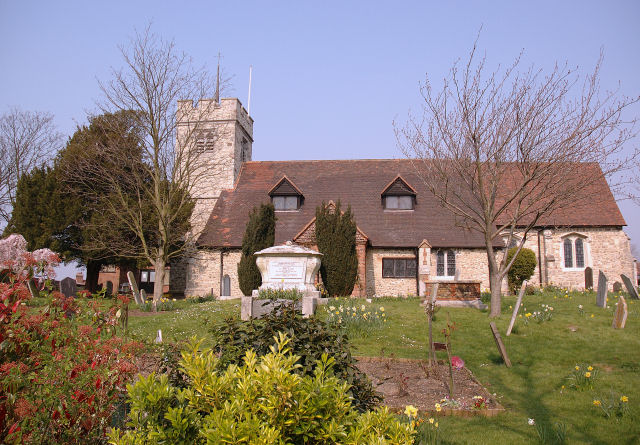
My first impression here is what a magnificent building this is, and how it really needs a larger format (like a 16x20 print) to properly convey it's majesty. Aside from that, there's a lot going on, which I personally like, but busy photos don't tend to score well on DPChallenge, where most voters prefer simplicity.
Good composition. There is a clear focal point in the marker or whatever it is in front of the building which is a bit brighter than the rest of the photo so draws the eye. It provides an anchor for exploring the other great details throughout the photo. The horizontal format and mostly horizontal and vertical lines convey the sense of serenity that is suggested by the title. A few diagonal lines add interest without distracting from the calm feeling.
The foreground bushes and midground trees give a sense of depth. But the building appears very flat since the light comes from directly behind so doesn't reveal its depth. The quality of light is very nice; it's just its direction that isn't very interesting. Certainly that's out of your control for the challenge, but try shooting this same scene at different times of the year when the sunlight will come from different directions.
The main technical problem with this photo is the lack of focus. This is partly because of your wide-open aperture; I think shooting at f/7 or f/8 with a slower shutter speed would have made a sharper photo. But there's also what looks like jpeg compression artifacts; a lot more than I would have expected for the size of your file. Did you save with a low or medium quality somewhere during your processing? Or perhaps did a lot of load/modify/save cycles (each of which reduces the quality)? However it happened, it really kills the crispness.
The photo is also a bit washed out; it needs to be darker and have the contrast boosted a bit. In Levels, move the midtone slider to the right a bit (and perhaps the black slider too to emphasize the shadows a bit), and in Brightness/Contrast, move the contrast slider just a bit to the right. Try it; it really makes the photo pop!
Actually, since you shot this in raw, I suggest starting over again from the raw conversion. Make your levels and contrast adjustments there along with the color. And if saving as jpeg, be sure the highest quality is selected. (Ideally, use tiff as the intermediate file format to avoid the lossy compression altogether.) And assuming your crop wasn't too extensive, you'll have the pixels and the quality to make a nice large print!
One last suggestion is to convert this to black and white. Getting the tones just right is an art itself! But b&w tends to emphasize the forms and textures more and has a lot of potential for this photo.
Right then, joke's on me as I now have to plough through 564 images and bump them all (yes, all of them) up. There'll be a third run through for fine tuning. It's day two three now and I'm running late, sorry.
It's the colors, they don't pop for me. The whole shot seems to run into one... I don't know it looks like it could be so much more but lacks, not sure what tho. 7