| Author | Thread |
|
|
04/15/2007 11:25:27 PM |
Greetings from the Critique Club.
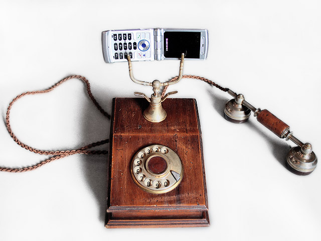
Very well done. Exposure and processing are perfect. Lighting is good, but not great. There is no distracting glare and the shadows are just right. But the photo is a bit flat; the lighting doesn't reveal the 3-dimensional form very well.
I like the nice, simple composition. The white background works well (and the cell phone shows against it, quite a technical feat!). I do think the photo could use some more space at the top.
This is a clever idea for the challenge, and though it probably won't have much interest outside that context, it meets the challenge perfectly. Good job! |
|
Comments Made During the Challenge  |
|
|
04/05/2007 12:19:09 AM |
|
|
|
04/04/2007 10:02:32 AM |
| Witty. I don't like the center composition, but that's what you wanted. I'm still giving you high marks. |
|
|
|
04/03/2007 12:14:45 PM |
| I like the image the only suggestion I would give is would of been better if you didn't show the antique telephone's receiver and left the cell phone where it is. It just one man's opinion the image is good regardless. |
|
|
|
04/02/2007 10:43:26 PM |
|
Home -
Challenges -
Community -
League -
Photos -
Cameras -
Lenses -
Learn -
Help -
Terms of Use -
Privacy -
Top ^
DPChallenge, and website content and design, Copyright © 2001-2025 Challenging Technologies, LLC.
All digital photo copyrights belong to the photographers and may not be used without permission.
Current Server Time: 03/12/2025 05:33:54 PM EDT.