CRITIQUE CLUB CRITIQUE
by karmat
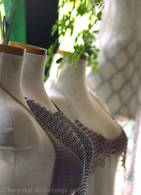
You have almost a perfect bell curve on this shot. This would tell me that most people thought it was "okay" but there just wasn't anything compelling to make it "jump out" at the viewer.
Compositionally, I find myself leaning to the right, trying to make the picture shift to the left some. I think having the subject in the left of the frame is a very good thing. It gives strength and stability to the composition. However, I think it needs just a bit more room on the right so that it doesn't feel quite so cramped. Also, I can't decide if I like the space at the top or not. One part of me says it needs to be cropped, but another says that it wouldn't work too well.
Technically, again, you have a good shot. The lighting is good (a touch bit flat, perhaps, but that could just be my monitor), exposure is good, and focus is good. I actually like that it is the middle one that is in focus, not the front one, but I can't help but wonder if that didn't hurt you in voting. They blend together, and the front oof one almost overpowers and blocks the focused one. That may be what is making me "lean right" when I look at it.
You met the challenge and had a good shot. It is a good idea. If I need to further clarify or explain myself, please feel free to contact me.
karma |