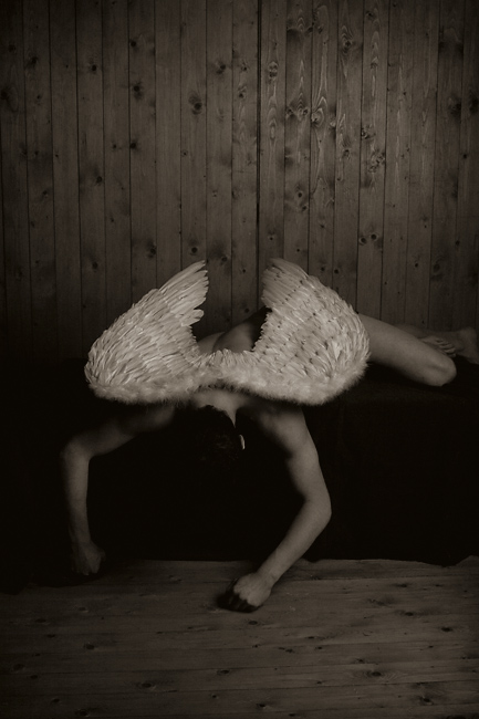
Greetings from the Critique Club
This is an expressive photo, underappreciated by the voters. A bit disturbing; I assume that's intended, but it's also one reason for the disappointing score. The low key and sepia color create a somber mood, which is enhanced by the model's position. The composition is simple and effective, especially the negative space at the top that encourages the viewer to consider where the angel was before falling. The lighting is great, nicely showing the form of the body and gently illuminating the wings.
But although the low key is appropriate for this photo, I think it's a bit overdone. The highlights should be just a bit brighter, and I'd like to be able to distinguish the head, which gets lost right now. Perhaps that was intended, but I find it a bit disturbing; he almost looks decapitated.
Overall, great job. The photo conveys a strong feeling, even if it isn't a pleasant one. |