| Author | Thread |
Comments Made During the Challenge  |
|
|
04/17/2007 09:33:13 PM |
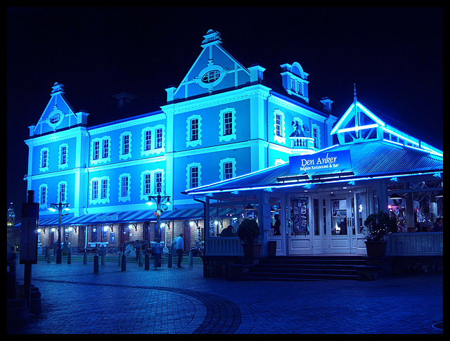
| Very nice, love the blue! |
|
 Photographer found comment helpful. Photographer found comment helpful. |
|
|
04/17/2007 04:32:51 PM |
cold ,
i like the colours
nice shot |
|
| Photographer found comment helpful. |
|
|
04/17/2007 01:07:53 AM |
| i dont like the blue color to this |
|
| Photographer found comment helpful. |
|
|
04/13/2007 06:46:30 PM |
| I love the colour in this! Great job. |
|
| Photographer found comment helpful. |
|
|
04/13/2007 02:48:23 AM |
| One of the first ones I connected to in this challenge. I love it. |
|
| Photographer found comment helpful. |
|
|
04/12/2007 09:32:35 AM |
| Weird lighting... almost seems artificial... how'd you do it? |
|
| Photographer found comment helpful. |
|
|
04/12/2007 12:59:25 AM |
| A little too much blue for me. |
|
| Photographer found comment helpful. |
|
|
04/11/2007 02:04:17 PM |
| I'm loving the blue.. I'm guessing you used that little lightbulb icon setting thing.. Idk what it's called.. But it looks great. |
|
| Photographer found comment helpful. |
|
|
04/11/2007 01:59:03 AM |
| Hmm, the blue tone is interesting, but I think it's too much. It would be fine if elsewhere in the image had some other colours to balance it, but it just looks like the WB is wrong. |
|
| Photographer found comment helpful. |
Home -
Challenges -
Community -
League -
Photos -
Cameras -
Lenses -
Learn -
Help -
Terms of Use -
Privacy -
Top ^
DPChallenge, and website content and design, Copyright © 2001-2025 Challenging Technologies, LLC.
All digital photo copyrights belong to the photographers and may not be used without permission.
Current Server Time: 03/12/2025 07:44:04 PM EDT.