| Author | Thread |
Comments Made During the Challenge  |
|
|
12/16/2003 11:37:42 PM |
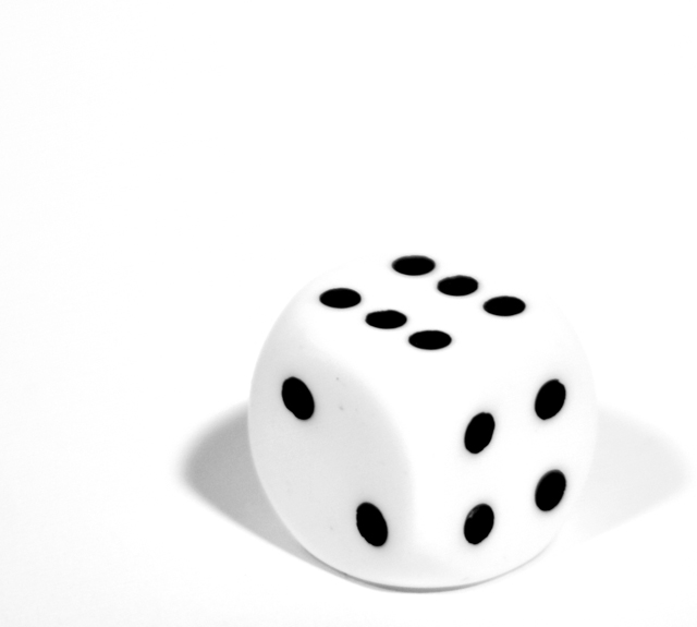
This is so perfect for this challenge!
My only suggestion is; the clarity of the dots is a little soft or something to me.
I think if you utilized the allotted file size it might help this out.
You are only at 46,979 bytes and you can go up to 150,000 bytes.
You might play with the compression a little and max it out in future challenges to improve the clarity of your shots. It still gets a 9 from me. :) |
|
 Photographer found comment helpful. Photographer found comment helpful. |
|
|
12/16/2003 10:48:54 AM |
| The light/shadow in this photo is wonderful, nice job. |
|
| Photographer found comment helpful. |
|
|
12/14/2003 12:44:30 PM |
| Nice framing, simple photo. It's a little out of focus though and the white dice blends too much with the background. |
|
| Photographer found comment helpful. |
|
|
12/13/2003 05:43:26 AM |
| Good idea and well composed. Only a little too bright for me and could be also sharper too. |
|
| Photographer found comment helpful. |
|
|
12/12/2003 10:03:13 PM |
| Simple. Elegant. Love it! |
|
| Photographer found comment helpful. |
|
|
12/11/2003 02:36:52 PM |
| Excellent composition and simplicity. Too bad it's so blurry... |
|
| Photographer found comment helpful. |
|
|
12/11/2003 11:16:56 AM |
| I like the contrasts here, but the die seems a bit out of focus, not sure if that's what was intended. I would have liked to have seen it a bit sharper. |
|
| Photographer found comment helpful. |
|
|
12/11/2003 08:05:12 AM |
| Great, I love this! how simple can it get!!!! lighting is great subject/object is great too! |
|
| Photographer found comment helpful. |
|
|
12/10/2003 09:39:40 PM |
| I think changing the contrast between the dice and the background would make this a more striking image. Try to make the edge and shadow disappear. |
|
| Photographer found comment helpful. |
|
|
12/10/2003 09:03:36 PM |
| Need perfect lighting to bring out white maybe a little differnent lighting and darking the contrast |
|
| Photographer found comment helpful. |
|
|
12/10/2003 08:15:34 PM |
| nice image...seems a tad overexposed |
|
| Photographer found comment helpful. |
|
|
12/10/2003 05:45:50 AM |
+Simply and to the point. Interesting composition. Lighting is very good. I like how the dice almost blends into the background.
-None
Score10 |
|
| Photographer found comment helpful. |
Home -
Challenges -
Community -
League -
Photos -
Cameras -
Lenses -
Learn -
Help -
Terms of Use -
Privacy -
Top ^
DPChallenge, and website content and design, Copyright © 2001-2025 Challenging Technologies, LLC.
All digital photo copyrights belong to the photographers and may not be used without permission.
Current Server Time: 03/12/2025 05:27:34 PM EDT.