| Author | Thread |
|
|
04/18/2007 05:06:27 AM |
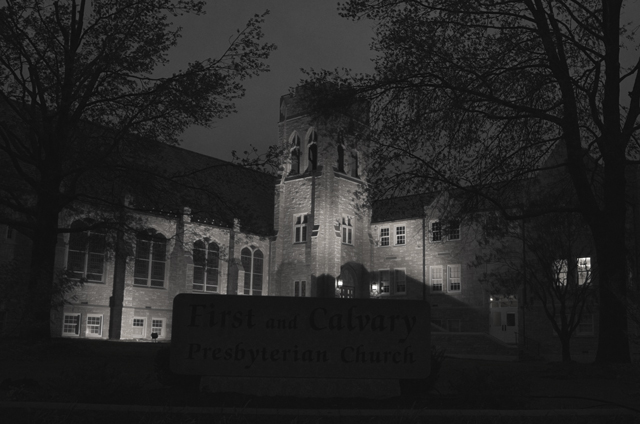
| I think the exposure is pretty good; I couldn't read the sign on my monitor at home but I can on the one at work. I can see where you wanted to include it, but maybe a shot just beyond the sign? To me it kind of breaks up the flow of the building. |
|
 Photographer found comment helpful. Photographer found comment helpful. |
Comments Made During the Challenge  |
|
|
04/17/2007 08:01:13 PM |
| seems out of focus, and could use more contrast. |
|
| Photographer found comment helpful. |
|
|
04/16/2007 08:47:40 PM |
| perhaps lighter highlights would give this more impact |
|
| Photographer found comment helpful. |
|
|
04/16/2007 01:20:47 AM |
| the words are really underexposed or they have no light on them |
|
| Photographer found comment helpful. |
|
|
04/14/2007 10:19:39 PM |
| Too bad the sign was not lit up. |
|
| Photographer found comment helpful. |
|
|
04/12/2007 01:23:26 PM |
| Hard to read the sign in front of the church. Something makes it appear unlevel also. Otherwise, pretty good. |
|
| Photographer found comment helpful. |
|
|
04/12/2007 01:58:01 AM |
| love the dark ominous and just about eerie, horror movie feel i get from this image ... fully expect dracula or some living dead person to jump right out of the monitor!!!!! .. arghhhhhhhhhh !! |
|
| Photographer found comment helpful. |
Home -
Challenges -
Community -
League -
Photos -
Cameras -
Lenses -
Learn -
Help -
Terms of Use -
Privacy -
Top ^
DPChallenge, and website content and design, Copyright © 2001-2025 Challenging Technologies, LLC.
All digital photo copyrights belong to the photographers and may not be used without permission.
Current Server Time: 03/12/2025 02:54:37 AM EDT.