| Author | Thread |
|
|
09/10/2007 04:04:12 PM |
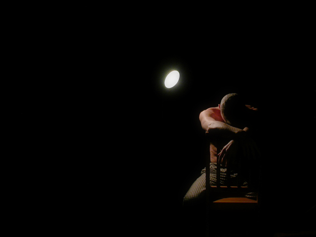
| This conveys to me someone struggling with the spotlight that others shine on them.Truly excellent shot , lots of emotion. |
|
|
|
12/23/2003 04:08:55 PM |
Greetings from the Critique Club :)
Hi Kosmik...
I think this is an excellent example of simplicity. The negative space adds a great deal to that for me. The image itself looks simplistic, but the emotion created by the image feels quite complex. Being in the spotlight is a complex situation. Attention to detail when in that situation is critical and complex at the same time :) There is a feeling of desperation in this image... a sense of weariness... burden...
There could have possibly been another opportunity in this photo by movign the light source out of the frame as well... I don't think it would make any impact on the theme, but it could present a slightly different feel...
Excellent work as usual :)
John Setzler
|
|
 Photographer found comment helpful. Photographer found comment helpful. |
Comments Made During the Challenge  |
|
|
12/16/2003 08:24:38 PM |
| I like the lighting here. I think it would be improved if you could have eliminated the spot from the shot though. |
|
|
|
12/16/2003 11:07:03 AM |
| I have always liked the use of light and shadow, interesting shot. |
|
|
|
12/13/2003 11:03:01 AM |
| Stunning portrait, composition and lighting perfect. 10 |
|
|
|
12/12/2003 12:05:11 AM |
| So far my favorite. Wondeful picture, with a lot of emotion. I love the lighting and shadows. Good job |
|
|
|
12/11/2003 02:45:32 PM |
| It's wonderful... the bright light spot just steals too much attention. :/ Without it, I would've given it a 10. |
|
|
|
12/11/2003 02:43:54 AM |
| Very artistic. This certainly is not a simple shot to take but I like the use of black to convy the theme of simplicity. |
|
|
|
12/11/2003 02:26:32 AM |
| very very cool. i think it might look even better if the light wasn't showing. however, like it is, it's still a very fine shot. |
|
|
|
12/10/2003 11:42:09 PM |
| this is technically a superior image. great lighting , love the negative space here and the model looks great. I think if you were going for simple, you might have shown the face because, to me, the image as shown is made complex by my wanting to know what the subject is going through and I am not able to tell that with his head down. I'll let the technique out way that a bit. |
|
| Photographer found comment helpful. |
|
|
12/10/2003 09:04:23 PM |
| great use with the light excellent subject 9 |
|
|
|
12/10/2003 08:26:01 PM |
I like this image. IMHO I am not sure about your choice of cropping
The negative space on the left doesn't seem to work |
|
|
|
12/10/2003 05:44:15 PM |
| whoa! Very nice! Love the idea, the shot, composition and lighting. Very well done! |
|
|
|
12/10/2003 05:31:09 PM |
| Great!, I think it was not simple to take a photo like this eh? Nice done. |
|
|
|
12/10/2003 12:46:03 PM |
| Simple? It´s really complex, in shades, paterns and colors! |
|
|
|
12/10/2003 12:33:52 PM |
Technical: Most all images submitted fit the challenge. This one does well. Exposure composition focus lighting all great.
Personal:I really like it. Very.... simple!
My vote: 7
|
|
|
|
12/10/2003 12:27:29 PM |
|
|
|
12/10/2003 12:19:42 PM |
| i'm not a talker...10 from me :) |
|
|
|
12/10/2003 10:09:17 AM |
|
|
|
12/10/2003 02:21:48 AM |
|
Home -
Challenges -
Community -
League -
Photos -
Cameras -
Lenses -
Learn -
Help -
Terms of Use -
Privacy -
Top ^
DPChallenge, and website content and design, Copyright © 2001-2025 Challenging Technologies, LLC.
All digital photo copyrights belong to the photographers and may not be used without permission.
Current Server Time: 03/12/2025 02:40:52 AM EDT.