CRITIQUE CLUB CRITIQUE
by karmat
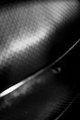
First impression -- Honestly, I kinda went, "huh?" Then, I read the title, looked closer at the picture, and had to laugh, more out of experience, than anything.
Compositionally, the framing you have chosen isn't really interesting to me. There is nothing really to "rest" the eyes on, and no where for them to "go" within the picture. Therefore, without the title, the viewer may miss the "story" behind the shot.
Technically, the focus and exposure is good, and the bw works well.
If you wanted a higher score, I would suggest trying a couple of things. Having some "context" in the background could add some interest to the "story" and would help to draw the viewer in. Too much, though, and it will overshadow the subject and be distracting. Another option would have been to rotate it to the right about 30 degrees so that it was in the diagonal in the frame. If nothing else, this would help to add some "motion" to the shot, and it wouldn't feel quite so static.
If I need to further clarify or explain myself, please feel free to contact me.
Karma |