CRITIQUE CLUB CRITIQUE
by karmat
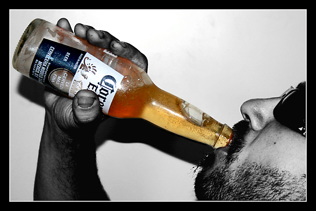
Compositionally, I like the interplay between the elements here. They form a triangle which gives the image stability, yet has an easy "path" for the eye to follow. It is a bit disjointed at the bottom, so I am wondering if a looser crop showing the entire arm wouldn't have been better.
Technically, the shadow is killing this shot, I think. The focus is good, you have used selective desaturation in a manner that isn't as obnoxious as it typically is, but that shadow jumps out at the viewer and screams for attention. Looking at the settings you have chosen, I'm wondering if you could have done a couple of things to prevent it. A slower shutter speed would not have been a good thing, unless you (or your model) can hold *really* still, so I'm wondering if a lower aperture number would help, or even using ISO 800, though that may have introduced too much noise.
IF you were using a flash, using a slower shutter speed might allow more ambient light between the subject and backdrop, and the flash would "freeze" the subject so that the slower shutter speed didn't blur everything. OR you could try bouncing the flash off the ceiling or a piece of white paper to one side.
If you were intentionally trying to have a strong shadow, you succeeded, but I don't think it adds to the shot, at all. :)
Finally, the voters seem to like "in your face" challenge interpretations. I see the bubble, but it took me a minute. Free studies are bears to score well in, so welcome to dpc, and I look forward to seeing more of your work. Oh yea, your user name cracks me up.
If I need to further clarify or explain myself, please feel free to contact me.
karma |