| Author | Thread |
Comments Made During the Challenge  |
|
|
12/16/2003 04:11:40 PM |
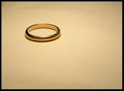
| Not bad at all. I think a different colour contrasting background may help. |
|
|
|
12/16/2003 09:57:25 AM |
|
|
|
12/16/2003 09:09:23 AM |
| oh boy....I sense some negative vibes! |
|
|
|
12/15/2003 10:36:52 PM |
| Depends... Some are really happy. But even I do not agree with the concept, the photo is good looking.I am not sure but maybe a softly contrasting background would have helped the ring to pop out more. 9 |
|
|
|
12/13/2003 09:30:51 PM |
| Oh, this could be taken in many ways... :) Nice shot... could have been a little larger for greater effect, but all the elements are here. |
|
|
|
12/12/2003 11:34:39 PM |
| OOOOH! Essence of Evil! Must refer to the frame around an otherwise very nice photo. |
|
|
|
12/12/2003 09:56:46 PM |
I'll be honest, the title had an negative impact on my impression of the photo. Had it been "simply love" or "love everlasting" or something like that, the impact would have been more positive.
Not to dwell on the title....I wonder how the shot would have been different had the ring been caught "spinning" in the photo. Just thinking out loud...
|
|
|
|
12/12/2003 07:29:36 PM |
| LOL -- I can think of a couple of ways to tie the image with the quote. Marriage band? Or the One Ring? Yeah, I'm one of the geeks looking forward to the next LOTR installment. Beyond that, nice composition and coloring. The ring feels a little off pure horiszontal and that bothers my eye a bit. (It looks like the ring slants up and to the right just a slight amount -- like the camera wasn't parallel to the surface the ring was on.) It may be an optical illusion -- if it is, no worries, if not, you might want to think about a small amount of rotation (clockwise) to the image. The highlights work well, for me, but the uneven darker areas at the extreme top and bottom edges would be better evened out. All my opinions of course. Good luck. |
|
|
|
12/12/2003 07:24:30 PM |
|
|
|
12/12/2003 01:31:58 PM |
| Ooooo. Bad experience? A more contrasting color for the surface would add to visual impact. |
|
|
|
12/11/2003 11:56:20 PM |
|
|
|
12/11/2003 11:40:08 PM |
| Pretty cynical . . . but simplicticaly so |
|
|
|
12/11/2003 02:32:18 PM |
| Evil, huh? Somebody's bitter. Composition is good, as is the lighting. |
|
|
|
12/10/2003 05:47:36 PM |
| marriage I assume. I could be wrong. Anyway, the message is not obvious, at least to me. Nice compo and lighting. The border adds a little as well |
|
 Photographer found comment helpful. Photographer found comment helpful. |
|
|
12/10/2003 01:15:26 PM |
| Is this an outtake from the shape challenge? Nope. But it was just done. And it's very similar. |
|
| Photographer found comment helpful. |
|
|
12/10/2003 09:06:09 AM |
| It can become a very hurtful weapon. |
|
| Photographer found comment helpful. |
|
|
12/10/2003 07:18:58 AM |
| I think I sense a theme here . . . |
|
| Photographer found comment helpful. |
|
|
12/10/2003 12:16:09 AM |
|
| Photographer found comment helpful. |
Home -
Challenges -
Community -
League -
Photos -
Cameras -
Lenses -
Learn -
Help -
Terms of Use -
Privacy -
Top ^
DPChallenge, and website content and design, Copyright © 2001-2025 Challenging Technologies, LLC.
All digital photo copyrights belong to the photographers and may not be used without permission.
Current Server Time: 03/12/2025 06:41:32 PM EDT.