| Author | Thread |
|
|
05/07/2007 10:46:52 AM |
Greetings from the Critique Club
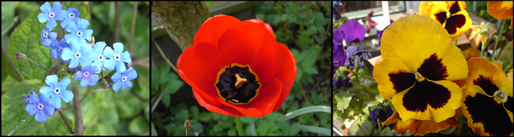
It's always nice to see floral subjects in a triptych. They lend themselves to some unusual combinations.
Your triptych has two warm toned images and one cool one. I wonder if it would have been more harmonious to have all the flowers the same tone, either warm or cool. Then, the image on the left and in the middle have green backgrounds, while the pansy has a rather busy floral with some sort of structure in the background. You might consider replacing that with a image with a simpler background for a more pleasing effect.
Finally, yes, if your camera will support it, a shallower depth of field would work wonders to make those blossoms 'pop' because it would blur the background and take away the distractions.
I see this is only your third Challenge. Welcome to DPC, and I shall look forward to seeing more of your work. |
|
 Photographer found comment helpful. Photographer found comment helpful. |
Comments Made During the Challenge  |
|
|
05/01/2007 08:37:36 PM |
| Nice colours but a little too busy to look at - More use of a shallow depth of field would have helped. |
|
| Photographer found comment helpful. |
|
|
05/01/2007 02:07:33 PM |
| pretty flowers, a flash or something may have made the colors pop more |
|
| Photographer found comment helpful. |
|
|
04/30/2007 08:06:56 PM |
|
|
|
04/30/2007 08:00:28 PM |
| Lovely shapes and colors. |
|
| Photographer found comment helpful. |
|
|
04/30/2007 06:17:58 PM |
| Each of the photo's have very busy backgrounds and this image probably would have worked better for me if you used a large aperature and blurred out everything but the actual flowers. |
|
| Photographer found comment helpful. |
Home -
Challenges -
Community -
League -
Photos -
Cameras -
Lenses -
Learn -
Help -
Terms of Use -
Privacy -
Top ^
DPChallenge, and website content and design, Copyright © 2001-2025 Challenging Technologies, LLC.
All digital photo copyrights belong to the photographers and may not be used without permission.
Current Server Time: 03/12/2025 04:59:22 PM EDT.