| Author | Thread |
Comments Made During the Challenge  |
|
|
05/05/2007 04:49:20 AM |
| Kind of cool image - just lacks a bit of wow factor. |
|
|
|
05/02/2007 07:37:35 AM |
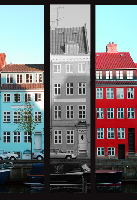
| I'm not sure the middle building being black and white is necessary. |
|
 Photographer found comment helpful. Photographer found comment helpful. |
|
|
05/01/2007 01:02:12 AM |
| Great set - I think I would have preferred all colour though. |
|
| Photographer found comment helpful. |
|
|
05/01/2007 12:46:57 AM |
Very GOOD idea, but lost in translation for me.
I love the three buildings - super. For me the frames in between are too thick and the idea of the B & W in between doesn't sing! |
|
| Photographer found comment helpful. |
|
|
05/01/2007 12:44:13 AM |
| Well framed and nice colors! |
|
|
|
04/30/2007 09:28:47 PM |
|
|
|
04/30/2007 08:37:13 PM |
|
|
|
04/30/2007 07:24:23 AM |
|
|
|
04/30/2007 01:22:32 AM |
| This has a sort of "squeeshed" feeling to it. The broad panel border on the inside that are lacking on the outside might be contributing to this. It makes the center frame seem smaller when in fact its the same size. Adding a consistent border around each panel would give this more balance. |
|
| Photographer found comment helpful. |
Home -
Challenges -
Community -
League -
Photos -
Cameras -
Lenses -
Learn -
Help -
Terms of Use -
Privacy -
Top ^
DPChallenge, and website content and design, Copyright © 2001-2025 Challenging Technologies, LLC.
All digital photo copyrights belong to the photographers and may not be used without permission.
Current Server Time: 03/13/2025 06:55:49 AM EDT.