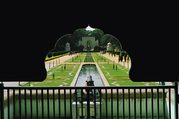
Challenge:Symmetry II (Basic Editing) Camera:Sony DSC-F717 Location: Tippu Sultan Summer Palace - Mysore/INDIA. Date: Apr 25, 2007 Aperture: Auto ISO: Auto Shutter: Auto Galleries:Architecture, History Date Uploaded: Apr 26, 2007
I had taken this pic at Tippu Sultans Summer Palace in Mysore. This area is "photography prohibited". This instance just prompted me to pull out my cam & shoot while it was still in my case !!! I didnt have enough time to do any settings et all !
Statistics
Place: 99 out of 249 Avg (all users): 5.8026 Avg (commenters): 7.0000 Avg (participants): 5.7455 Avg (non-participants): 5.8351 Views since voting: 816 Views during voting: 203 Votes: 152 Comments: 5 Favorites: 0
So this is your entry in Symmetry II. I think it works good for the challenge. I see symmetry in the shot. There are some things I really like here, but also some weak points, IMO. Let me start off with what I like.
The shape of the arch is great, it grabs my initial attention nicely, and hightens my desire to explore the image further. It serves as a nice framing element, and emphasizes the symmetry of the photo. You've lined up, and centered everything in the frame well. A great use of leading lines, and vanishing point to draw the viewer in, and take my eye into the shot, and to the structure at the end of the ponds.
A couple of your commenters have touched upon the negative space, the crop of the photo. I tend to agree here. All that space at the top doesn't seem to really be adding a lot to the image. In fact, to me, it almost gives an 'artificial' feel to the scene. I believe if the top were cropped down to just above the top of the arch, and I would even go so far as to suggest taking a touch off of each side, it could strengthen the composition significantly. You don't mention if you do any post processing to your photo. I think this is a case where a little bit of tweaking could be beneficial. One thing, I feel the photo could do with a little bit of sharpening, either usm, or smart sharpen are popular, or whatever your particular software has. Also, I don't really think there is a color cast, but...there is so much green in the shot, and with the lighting, it seems to be giving everything a bit of a green 'feel'. Even within basic editing rules, one can do a lot with color management on a shot. Again depending on specific software, but adjustments in either levels, curves, selective color, even hue/sat can be done. If this is something unfamiliar to you, there are lots of tutorials on the site, or ask in a forum. It really is very beneficial to learn at least basics when making great photos.
So, a good entry for the challenge. Nice subject, and interesting. 5.8 is not a bad score. I like your story of how you got the shot. :-) A very good eye here. I think post processing could be a key to taking a stride forward.
If you have any questions, or comments or anything, please feel free to contact me.
Nice shot. Personally, and this is just my own take on it, I would have cropped it from just above the gate where the black starts. I would've scored you higher if you had done that. 6 from me.