| Author | Thread |
|
|
05/08/2007 08:43:11 AM |
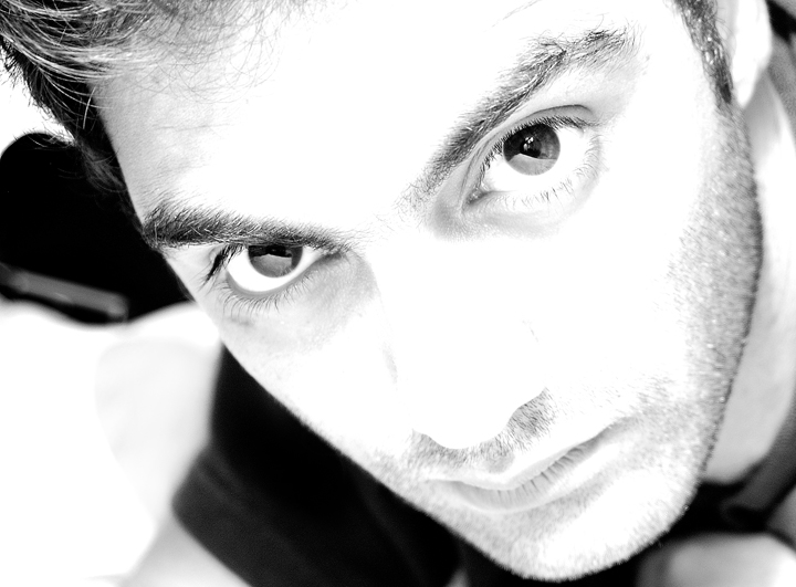
| Nice shot Hassan, I like the blown out look. |
|
 Photographer found comment helpful. Photographer found comment helpful. |
Comments Made During the Challenge  |
|
|
05/07/2007 06:43:36 PM |
| nice high key.. love the eyes :) |
|
| Photographer found comment helpful. |
|
|
05/05/2007 11:32:14 AM |
| This is an excellent high key shot. I'd suggest a little more work with the eyes (catchlight is taking up the bottom 1/2) so they stand out a little more. |
|
| Photographer found comment helpful. |
|
|
05/04/2007 09:31:48 PM |
| Very interesting perspective. I am immediately drawn to his eyes. Not sure I like the burned out parts of his forehead and midface although that is probably intentional on your part. |
|
| Photographer found comment helpful. |
|
|
05/04/2007 08:38:11 PM |
| I like the composition and how the head is angled which causes the eyes to be angled. I liked the blurred background. I am not to keen on the middle of the face being blown out. That just seems to take away from the photo. |
|
| Photographer found comment helpful. |
|
|
05/04/2007 11:02:24 AM |
| Not a bad study. Nice comp and crisp. |
|
| Photographer found comment helpful. |
|
|
05/03/2007 08:24:51 PM |
|
| Photographer found comment helpful. |
|
|
05/03/2007 10:19:44 AM |
I'd have pushed the high key even more, but try and save the eyes. Somehow this seems a little unbalanced with the lighting effort. The upper left appears as a nicely toned B/W photo, yet the bottom 2/3's of the face is blownout. Compositionally what you've included in the frame works well. One last thought, I think the eyes should be clearer. There's too much of the white reflector showing and is distracting.
All of the above is JMO of course. :D Good luck in the challenge. |
|
| Photographer found comment helpful. |
|
|
05/01/2007 09:53:53 PM |
| A little too high on the face for me. Interesting reflections in the eyes. |
|
| Photographer found comment helpful. |
Home -
Challenges -
Community -
League -
Photos -
Cameras -
Lenses -
Learn -
Help -
Terms of Use -
Privacy -
Top ^
DPChallenge, and website content and design, Copyright © 2001-2025 Challenging Technologies, LLC.
All digital photo copyrights belong to the photographers and may not be used without permission.
Current Server Time: 03/12/2025 09:28:13 PM EDT.