| Author | Thread |
Comments Made During the Challenge  |
|
|
05/06/2007 04:07:30 PM |
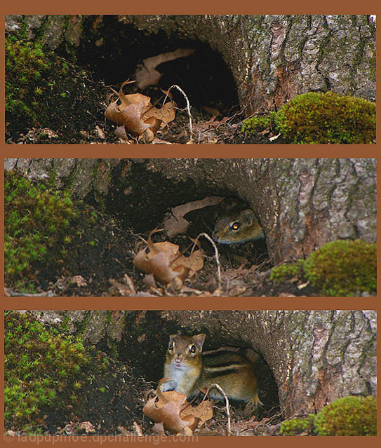
Oooh... Big sin here at DPC... Ya got red eye...
TC |
|
|
|
05/06/2007 03:53:17 AM |
| Nice story here. I'd suggest increasing the contrast, though, on each picture. Make the chipmunk stand out, and darken the surrounding. |
|
|
|
05/05/2007 05:15:41 PM |
| maybe try darkening the image or upping the contrast a little to make it 'pop'...nice shots of the chipmunk! |
|
|
|
05/02/2007 10:38:45 AM |
| Cute little thing - Has to be said though the flash catchlights in his eyes are distracting and because the flash has been used ontop of the camera or along side it this has made the images look very flat. If you notice your top image has good contrast and nice blacks which is good. This is how the others should have been edited too. |
|
 Photographer found comment helpful. Photographer found comment helpful. |
|
|
05/02/2007 06:01:20 AM |
| Cute series of shots that work well together. The whole presentation could have been enhanced by a bit of editing... perhaps a contrast or levels adjustment. The top photo looks a bit crisper with more color compared to the other two. |
|
| Photographer found comment helpful. |
|
|
05/01/2007 08:52:26 PM |
| Cute sequence. I would fix the chipmunk's red eyes and use a darker border/background so as to not distract from the images. |
|
| Photographer found comment helpful. |
|
|
04/30/2007 06:34:51 PM |
| I think if you bumped up the saturation & contrast on this, it would have made the images pop more. The brown background is also a bit distracting. It doesn't really pull any color from the images or enhance them. I think a black or white would have made a big difference. IMHO |
|
| Photographer found comment helpful. |
|
|
04/30/2007 01:32:26 AM |
| Cute not too sure of the brown border though |
|
| Photographer found comment helpful. |
Home -
Challenges -
Community -
League -
Photos -
Cameras -
Lenses -
Learn -
Help -
Terms of Use -
Privacy -
Top ^
DPChallenge, and website content and design, Copyright © 2001-2025 Challenging Technologies, LLC.
All digital photo copyrights belong to the photographers and may not be used without permission.
Current Server Time: 03/14/2025 06:07:29 AM EDT.