| Author | Thread |
Comments Made During the Challenge  |
|
|
05/07/2007 10:22:17 PM |
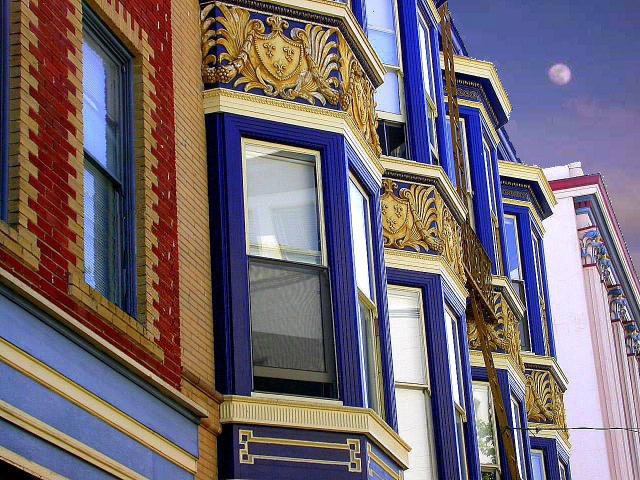
| There is bad posturization in the sky, not sure if it is from the jpg compression or not. If the shot was tilted down slightly to remove the sky from the image it would be a very geometric image. |
|
 Photographer found comment helpful. Photographer found comment helpful. |
|
|
05/07/2007 02:13:39 PM |
| An eye pleasing shot with nice contrast and colors. Only pitty so many of the lines are jagged, might want to tweak the resizing and sharpening steps. And would've liked to see that horizontal line near the bottom right, cloned out. |
|
| Photographer found comment helpful. |
|
|
05/04/2007 04:04:49 PM |
| The perspective and color contrasts are very striking, this is definitely a photo that gets noticed. The edges all seem a bit jaggy on my monitor though, which suggests too much sharpening? Great effort - 7. |
|
| Photographer found comment helpful. |
|
|
05/04/2007 02:44:18 PM |
|
| Photographer found comment helpful. |
|
|
05/03/2007 01:48:52 PM |
|
| Photographer found comment helpful. |
|
|
05/02/2007 08:40:26 AM |
| great colours but i'm not sure what is going on with the sky and moon? The houses look really sharp and clear but the sky looks really blurred and looks like it does not belong there, looks like a bit of a PS bodge to be honest. |
|
| Photographer found comment helpful. |
|
|
05/01/2007 03:34:29 PM |
|
| Photographer found comment helpful. |
Home -
Challenges -
Community -
League -
Photos -
Cameras -
Lenses -
Learn -
Help -
Terms of Use -
Privacy -
Top ^
DPChallenge, and website content and design, Copyright © 2001-2025 Challenging Technologies, LLC.
All digital photo copyrights belong to the photographers and may not be used without permission.
Current Server Time: 03/19/2025 03:34:38 AM EDT.