CRITIQUE CLUB CRITIQUE
by karmat
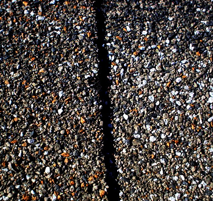
Compositionally, you have added a bit of interest to this shot by having it just a touch on the diagonal. Had it been perfectly vertical, I'm afraid the shot would have seemed terribly static.
Technically, the lighting is very harsh in this. While that sets up a nice contrast, it also makes it seem stark and makes a lot of the details mesh in the darkness.
While I'm glad you didn't risk your neck trying to get to the roof, I think a couple of things could have been done differently to make this shot more interesting. As it is right now, the viewer looks at it and says, "okay, it is a shot of some kind of pebbly stuff with a dark line down the middle." There is not a lot else to be interesting or to compel that same voter to do more than give it a cursory glance and move on. I suspect it would have been more effective if you could have made a macro out of it. Most sonys seem to have awesome macro capability, but I'm not sure about yours, or with the 70-200 on it. That said, if it were to show a close up of this, it would give the viewer something that is different or unique.
Also, the line down the middle says "symmetry," but there are voters who are very strict in their definitions, and this may not have flown with them.
If your goal was to enter the challenge, and just shoot to have fun, then you may have accomplished that. If, however, you are wanting to score higher or place higher, always try to look at your pictures from the point of view of a rushed voter and say, "Is there something, anything, that will grab the viewer and make them want to stay with my picture." If not, try to reshoot, find another subject, or check your post-processing to see if anything else can be done. Sometimes something as simple as rotating, a different crop, or mirroring/flipping an image can make it really connect with the viewer.
If I need to further clarify or explain myself, please feel free to contact me. Best to you in future challenges.
karma |