DPChallenge: A Digital Photography Contest You are not logged in. (log in or register
 
Challenge Entries
Portfolio Images
This image is not part of a public portfolio.
Escape From Alcatraz
EssAreDubya


Photograph Information Photographer's Comments
Challenge: Free Study 2007-04 (Expert Editing*)
Camera: Canon EOS-350D Rebel XT
Lens: Canon EF-S 17-85mm f/4-5.6 IS USM
Location: San Francisco, CA
Date: Apr 22, 2007
Aperture: f/14
ISO: 200
Shutter: 1/500
Galleries: Panoramic, Seascapes
Date Uploaded: Apr 30, 2007

Open in Aperture Software. Reduced exposure. Exported to PS2. Cropped. Increased Blue, Green saturation. High Pass sharpened. Reduced size to DPC specifications. Reduced noise. Saved for web.

Statistics
Place: 439 out of 573
Avg (all users): 5.2050
Avg (commenters): 5.0000
Avg (participants): 5.0965
Avg (non-participants): 5.4681
Views since voting: 677
Views during voting: 218
Votes: 161
Comments: 2
Favorites: 0


Please log in or register to add your comments!

AuthorThread
05/09/2007 12:32:56 AM
CRITIQUE CLUB CRITIQUE
by karmat

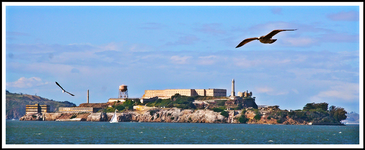
Compositionally, this shot is not bad, and has a couple of things that really help it. First, I like that it has basically three "levels" in it -- the water, the island, and the sky. This gives it a dynamic range and breaks the image into "smaller" parts so that the viewer is not overwhelmed. I also think that having the island sit lower in the frame like that gives it a sense of stability and balance. I think it may be an illusion, but it seems tilted ever so slightly to the right. Like I said, it may just be me. I didn't put a grid or anything on it to see for sure. The two birds also add a bit to the composition, the one on the right more than the one on the left, I think.

Technically, the shot is okay. There is nothing that I can point to that is "wrong," but I think it could really be processed a bit more to make it *pop* and thus draw the viewer in. One thing that might have made a difference would be to use a gradient instead of adjusting the saturation. Doing that may have allowed you to richen the sky colors without making them seem too bright. The clouds almost look unnatural, and I *think* it may be from the saturation of the blues. Likewise in the water, the waves look a bit odd in spots, and it may be from saturation.

Very interesting shot, and would make a nice postcard, oddly enough.

If I can further explain or clarify myself, please feel free to contact me.
karma
 Comments Made During the Challenge
05/01/2007 03:40:52 PM
This is a lovely shot, but you must find a way to deal with the dust on your sensor.:)
  Photographer found comment helpful.


Home - Challenges - Community - League - Photos - Cameras - Lenses - Learn - Help - Terms of Use - Privacy - Top ^
DPChallenge, and website content and design, Copyright © 2001-2025 Challenging Technologies, LLC.
All digital photo copyrights belong to the photographers and may not be used without permission.
Current Server Time: 03/12/2025 03:01:16 PM EDT.