| Author | Thread |
|
|
05/19/2007 08:04:58 PM |
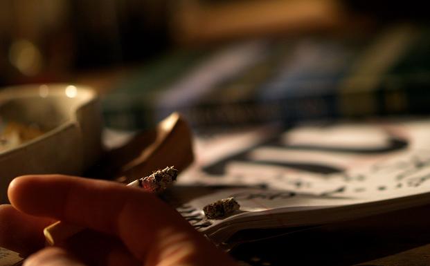
You know how i feel about this photo. I like the cherry, the blurred pi and the shadowing and contrast..it's deep.
|
|
|
|
05/13/2007 12:48:01 AM |
CRITIQUE CLUB CRITIQUE
by karmat
Welcome to the world of dpc!
There are a couple of things about this shot that work really well. First, it is a good idea. It gives the impression of a student, stressed from exams and what not, trying to relax by smoking. Also, the focus and detail on the ash at the end of the cigarette is very nice. I also like the shallow depth of field and how the background is tilted ever so slightly. That keeps it from being static, and gives it a bit of a chaotic feeling, which fits in with the rest of the shot.
I think what probably hurt you the most is that it seems a bit dark, and I had to study it for a few seconds to understand what was going on. In a challenge where people are cruising through, this can be almost fatal for the score. A bit more light on the hand and cigarette would help this, I think. Also, if the hand were more "in" the picture, so that it wasn't hanging out of the frame it would feel more complete as well, I believe. I think that would also help tie the two things together.
Nice shot. It tells a story, and has some really good elements to it. I look forward to seeing your future entries. If I need to further explain or clarify myself, please feel free to contact me.
Karma |
|
|
|
05/10/2007 01:27:53 AM |
| This is a really cool image. I can see where someone who is struggling with pi would be using up a lot of cigarettes. And I think it is technically very good: Focus/DOF, color, composition, light. I think this was under rated by the voters because they didn't understand it. Don't be discouraged by this. |
|
Comments Made During the Challenge  |
|
|
05/07/2007 10:08:13 PM |
| ohhh, a modern twist to the quest. Nice image. |
|
|
|
05/04/2007 11:23:16 AM |
| Hmm, I don't get it. What's the focus of the image? The composition might improve with closer cropping. But at the end of the day, I just don't get it. |
|
|
|
05/03/2007 03:59:57 PM |
| Too much going on in this photo - needs a stronger central concept. The Pi symbol could be it, but it is out of focus. The top 1/2 is indistinguishable. |
|
|
|
05/03/2007 11:02:36 AM |
| dont burn your finger... nice shot.. |
|
|
|
05/03/2007 08:54:24 AM |
| I think I know what you were going for but I think your dof is too shallow, I can't really make out what else is on the paper (other than one big Pi), maybe if the focus had been the other way round? With the hand blurred and the paper sharp this would have been better? |
|
|
|
05/02/2007 04:38:27 PM |
|
|
|
05/02/2007 11:42:12 AM |
| hmm i really dont understand this idea of the picture i think that you need to be more creative |
|
|
|
05/02/2007 03:31:06 AM |
Aha, Obsessive-compulsive disorder. Needed to translate it, I'm Dutch :) But that doesn't matter to the picture of course.
By the way, who are real obsessive are the guys that celebrate Pi-day (in my opinion).
Pi-day (Wikipedia) |
|
Home -
Challenges -
Community -
League -
Photos -
Cameras -
Lenses -
Learn -
Help -
Terms of Use -
Privacy -
Top ^
DPChallenge, and website content and design, Copyright © 2001-2025 Challenging Technologies, LLC.
All digital photo copyrights belong to the photographers and may not be used without permission.
Current Server Time: 03/14/2025 10:23:58 PM EDT.