| Author | Thread |
|
|
06/02/2007 12:06:01 AM |
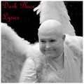
| Thanks all for your inspiring comments. You're right about the fonts, they got lost in the image a bit. |
|
|
|
05/21/2007 03:03:32 AM |
Hey there from the Critique Club
Camera Work/Technical: Great focus that makes every single element in this capture look crisp and clean. The vivid colors you captured suggest a proper white balance setting, as well as add some terrific elements into the frame.
Lighting: Your lighting is also very strong. Your shadows add some great texture and depth to the image.
Composition/Content: Overall, I'd have to say I like it. It is very clean and very busy all at the same time. I think that your titles, while made with very appealing fonts, need a little work to stand out more. Both get lost in the image, but just a little
My Opinion: I think that this one scored about where it should have. Nice work on a well-deserved 6+.
Thank you for the opportunity to provide a critique on your entry,
Eric
|
|
 Photographer found comment helpful. Photographer found comment helpful. |
Comments Made During the Challenge  |
|
|
05/20/2007 09:31:11 PM |
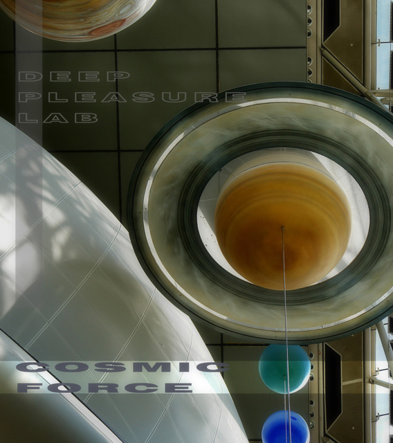
For DPL, depth = pleasure. They wanted a rhythm so deep that the earth would spin to it. They were looking for a beat in the heart of the Milky Way, a harmony that would warp gravitational fields. This was their pleasure. If you play this album, shut off all the lights. You will want to be alone with the Universe as you listen to it.
10 |
|
| Photographer found comment helpful. |
|
|
05/18/2007 11:17:15 PM |
| Not sure how this fits in |
|
|
|
05/18/2007 09:09:45 AM |
|
| Photographer found comment helpful. |
|
|
05/17/2007 10:52:52 PM |
| Very bold composition - love all the shapes and shades at play here. |
|
| Photographer found comment helpful. |
|
|
05/17/2007 02:15:01 PM |
| Probably the best text i've seen this challenge (so far) and the most album-cover like as a complete image... I just think if the background was blacked out so it was just planets and moons this would have been awesome. |
|
| Photographer found comment helpful. |
|
|
05/16/2007 04:56:56 PM |
| I'm guessing this is a very cool planetary display somwhere - great muted colors, wonderful light and texture. A very nice presentation! |
|
| Photographer found comment helpful. |
|
|
05/16/2007 12:58:54 PM |
| bonus points for sweet design skills. |
|
| Photographer found comment helpful. |
|
|
05/15/2007 04:07:08 PM |
|
| Photographer found comment helpful. |
|
|
05/15/2007 08:24:10 AM |
| A slightly busy image but it works for me. Suggestive of conceptual music on the album. |
|
| Photographer found comment helpful. |
|
|
05/14/2007 09:54:27 PM |
| Cosmic Force seems more visible than the actual name of the band. I would probably swap the fonts. |
|
|
|
05/14/2007 04:39:13 PM |
| Very creative and inspiring photography of elements....7 |
|
| Photographer found comment helpful. |
|
|
05/14/2007 12:16:04 PM |
| wonderful lines and forms! and colors too:) I like your album, would love to listen to it:) |
|
| Photographer found comment helpful. |
|
|
05/14/2007 11:13:28 AM |
| This really appeals to me. It is busy but somehow it all works! In my top picks. |
|
| Photographer found comment helpful. |
Home -
Challenges -
Community -
League -
Photos -
Cameras -
Lenses -
Learn -
Help -
Terms of Use -
Privacy -
Top ^
DPChallenge, and website content and design, Copyright © 2001-2025 Challenging Technologies, LLC.
All digital photo copyrights belong to the photographers and may not be used without permission.
Current Server Time: 04/02/2025 06:29:01 AM EDT.